
Quick Answer
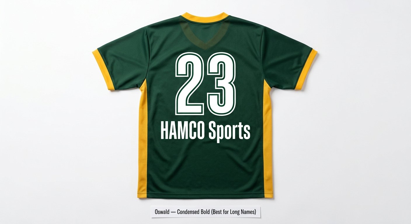
The safest jersey number fonts are heavy block styles such as Jersey M54, College Block, and Varsity, plus Oswald for long names. Pick thick, even strokes. Then check your league’s rule sheet: high school football and basketball numbers must be one solid color that contrasts with the jersey. Most free DaFont jersey fonts are for personal use only, so clear the license first.
The font on the back of your jersey is the last thing most coaches think about. It is one of the first things officials, scorers, and fans look at. Pick a weak font and numbers blur from the stands. Pick one that breaks your league’s number rules and your team may have to change jerseys before the game. Our football jersey design guide covers the whole uniform. This guide is only about numbers and names.
Here is what you get. We list 13 jersey fonts with checked download counts and license notes. We give the number size rules for each sport, each linked to its rule sheet. We end with a 60 second test to run before you approve a mockup. Colors matter as much as the font, so pair this with our best jersey color combinations guide.
Top Jersey Fonts at a Glance
Here is the short version. Download counts come from each font’s DaFont page on September 30, 2026. The last column matters most: a team uniform order is commercial use, and many free fonts do not allow it without a license.
| Font | Best for | Style | Downloads or price | License for a team order |
|---|---|---|---|---|
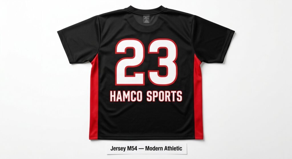
| Jersey M54 | Football, basketball | Heavy athletic block | 2,613,429 (DaFont) | Free for personal use; commercial use needs a donation or license |
| Sports World | Multi sport, signage | Bold athletic display | 1,778,265 (DaFont) | Marked 100% Free on DaFont |
| Legend M54 | Football, lacrosse | Athletic display | 1,365,373 (DaFont) | Free for personal use only |
| Superstar M54 | Baseball, basketball | Athletic slab serif | 1,137,117 (DaFont) | Free for personal use only |
| Academic M54 | Baseball, softball | Collegiate | 950,875 (DaFont) | Free for personal use only |
| Wanted M54 | Football, baseball | Bold collegiate | 909,947 (DaFont) | Free for personal use only |
| Varsity | All sports, youth leagues | Classic athletic block | 682,833 (DaFont) | No author or license listed; ask your printer |
| College Block | High school programs | Heavy collegiate block | 472,829 (DaFont) | Personal use only; commercial use needs a license from Sharkshock |
| Tourney | Basketball, flag football | Modern athletic (use weight 900) | Free (Google Fonts) | SIL Open Font License; commercial use allowed |
| Oswald | Long names, tight spaces | Condensed sans serif | Free (Google Fonts) | SIL Open Font License; commercial use allowed |
| Futura Bold | Soccer, volleyball | Geometric sans serif | Paid | Buy a license from a font seller |
| ITC Avant Garde Gothic | Soccer, club kits | Geometric sans serif | Paid | Buy a license from a font seller |
| Integral CF | Esports, modern programs | Heavy geometric display | $221.99 full family, 1 user desktop license | Paid; check the right license type with the maker |
Why Most Coaches Pick the Wrong Jersey Font
Most coaches spend hours on colors and logo placement. Then they leave the font to the printer or click the default. That is where costly mistakes start.
A font that looks sharp on a screen can fall apart on fabric. Thin strokes look even thinner from the stands. Tight spacing can make two digits look like one. Script numbers that look good in a design file are hard for an official to read at game speed.
There is also a rule many teams miss. Starting with the 2024/25 school year, NFHS football and basketball rules changed. The whole body of the number must be one solid color that clearly contrasts with the jersey. This rule covers football and basketball. Other high school sports have their own number rules, listed in the table further down.
Borders are still allowed. High school basketball numbers may use up to three colors, such as a solid number with thin borders or a shadow trim. What breaks the rule is a gradient, pattern, or second color inside the body of the number. Your font and your color setup need to work together.
Ready to order? Browse Hamco’s custom football uniforms and get a free mockup with your chosen jersey font within 12 hours.
The 4 Types of Jersey Fonts (And When Each One Works)
Classic Block Fonts: The Safe and Proven Choice
Block fonts are the base of jersey design. They use thick, even strokes with little decoration. There is nothing to confuse and nothing that fails at a distance.
Varsity is one of the most familiar block styles in American school sports. The Varsity file on DaFont has 682,833 downloads and was first seen on the site before 2005. DaFont lists no author and no license for it, so ask your printer which licensed version they use.
College Block by Sharkshock is the heavier choice. It suits a 10 inch football back number where thin edges would be a problem. It has 472,829 downloads on DaFont. It is free for personal use only, and the designer asks for a license agreement for commercial use.
Sports World by Sergiy S. Tkachenko has 1,778,265 downloads and is marked 100% Free on DaFont. That makes it one of the easier fonts on this list to use for a team order. Test it at your real front and back sizes before you approve.
Condensed Fonts: For Long Names and Tight Spaces
Long last names are a real design problem. A name like Kowalczyk or Vandenberghe does not fit across the shoulders in a wide block font without shrinking. Condensed fonts keep the letters tall and make them narrower.
Oswald is free on Google Fonts under the SIL Open Font License, so it is cleared for a team order. It is a reworking of the classic Alternate Gothic style. Its tall, strong strokes stay readable when a name runs long.
Legend M54 (1,365,373 downloads) and Superstar M54 (1,137,117 downloads) come from the same designer, justme54s. One correction to what you may read elsewhere: Superstar M54 is not a clean condensed sans serif. Its author calls it an athletic slab serif made for numbering sports jerseys. Both are free for personal use only.
Modern Sans Serif Fonts: For Teams With a Clean, Current Look
Modern sans serif fonts suit soccer, volleyball, esports, and any program that wants a cleaner look. The shapes are more geometric than classic block fonts, and the strokes are often thinner.
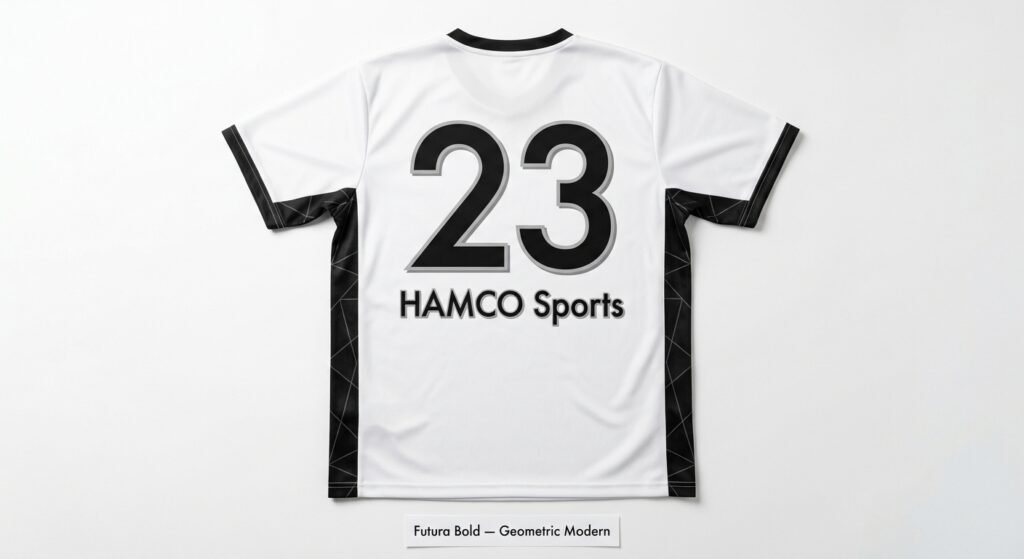
Futura is a geometric sans serif designed by Paul Renner and released in 1927. Futura Bold gives clean, round numbers. It is not free, so you or your printer need a license from a font seller.
ITC Avant Garde Gothic is another geometric sans serif. It grew out of the logo type Herb Lubalin made for Avant Garde magazine. Its wide, round shapes read well on light and dark kits. It is also a paid font.
Tourney is free on Google Fonts under the SIL Open Font License. Pick the weight with care. Its lightest weight is almost an outline, and only weight 900 is completely solid. For numbers, use 900. A light Tourney number is mostly outline, which clashes with the solid number rule in high school football and basketball.
One caution for this whole group: always pick the heaviest weight for numbers. A stroke that looks fine on a monitor can look thin at 6 inches on a basketball jersey.
Retro and Collegiate Fonts: For Programs With History (Or the Look of It)
Collegiate fonts signal tradition before a single play. They suit baseball, softball, and programs with a long history. For more looks, see our baseball jersey design ideas guide.
Academic M54 has 950,875 downloads on DaFont. Its author says it was inspired by college and university T shirts. It pairs well with a script team name on the chest.
Wanted M54 (909,947 downloads) is a bolder take on the classic collegiate style. Its author suggests it for kit numbers.
See your font on a real diamond with a free mockup from our custom baseball uniforms or custom softball uniforms pages.
Jersey M54: The Most Downloaded Font on This List
Jersey M54 by justme54s has 2,613,429 downloads on DaFont. That is more than any other font in this guide, Sports World included.
Its author calls it his version of a classic sports font, ideal for apparel design and naming sports jerseys. The letters are heavy and blocky, with a compact, solid look. That weight is why it reads well on football and basketball jerseys.
Here is what nobody can prove. The author publishes no fabric stretch tests, wash tests, or sublimation settings for Jersey M54. Any claim that it was tuned for polyester stretch or 50 washes is marketing, not fact. Print quality depends more on the printer, the fabric, and the stroke weight than on the font name.
Compared with Varsity, Jersey M54 looks more modern and a bit more rugged. Varsity looks more traditional. Both are thick enough for football and basketball numbers.
The license matters. Jersey M54 is free for personal use only. The author says commercial use needs a donation or a license, and asks buyers to email him for details. A team uniform order is commercial use, so clear it before your supplier prints.
The Official Jersey Number Size Rules by Sport
This is the section most jersey font articles skip. A great font means nothing if the numbers break your league’s rules. In college football, illegal jerseys can cost a team a 15 yard penalty and charged timeouts. Reprinting a full set is an expensive lesson.
| Sport and level | Front number | Back number | Stroke width | Other number rules |
|---|---|---|---|---|
| Football, high school (NFHS) | At least 8 in | At least 10 in | Bars approximately 1½ in | Number body one solid color that contrasts with the jersey |
| Football, college (NCAA) | At least 8 in | At least 10 in | Bars approximately 1½ in | Number color in distinct contrast with the jersey, border aside |
| Basketball, high school (NFHS) | At least 4 in | At least 6 in | At least ¾ in, border not counted | Plain Arabic numerals; up to 3 colors; legal numbers 0 to 5, 00, 10 to 55 pattern |
| Basketball, college (NCAA) | At least 4 in | At least 6 in | At least 1 in | One solid color; border up to ½ in; numbers 0 to 99, not both 0 and 00 |
| Baseball, high school (NFHS) | Not required | At least 8 in | Not listed | From the 2014 NFHS summary; confirm with your state |
| Baseball, MLB | Not required | At least 6 in | Not listed | Rule 3.03 |
| Softball, high school (NFHS) | Not required | At least 6 in | Not listed | From the 2014 NFHS summary; confirm with your state |
| Soccer, high school (NFHS) | At least 4 in (jersey or shorts) | At least 6 in | Not listed | Number must contrast with the jersey |
| Soccer, IFAB Laws of the Game | No size set | No size set | Not listed | Numbers are usually permitted; your competition sets the rule |
| Ice hockey, high school (NFHS) | None required; sleeves at least 4 in | At least 10 in, Gothic style | Not listed | Same numbers on both sleeves |
Two notes on this table. The NFHS summary for baseball and softball is dated April 2014, and it is the newest NFHS summary we found for those sports. Check your state association’s current sheet before you order. We left out the NBA because its public rule page does not state a clear front number size.
Stroke width is where fonts fail. High school and college football ask for number bars of approximately 1½ inches. High school basketball asks for at least ¾ inch, not counting the border. College basketball asks for at least 1 inch. A thin font scaled up still has thin bars, so start with a heavy weight.
For basketball coaches, here is the NFHS legal number list: 0, 1, 2, 3, 4, 5, 00, 10 to 15, 20 to 25, 30 to 35, 40 to 45, and 50 to 55. A roster cannot have both 0 and 00. NFHS also says numbers must be plain Arabic numerals, so skip decorative or distressed number styles for high school basketball. College basketball allows 0 to 99. Our basketball jersey design guide covers the rest of the layout.
Test your font on the digits your roster will use most. Pairs such as 3 and 8, or 1 and 7, are worth checking side by side in any thin or fancy font.
The 00, 11, 88 Test: A Quick Check Before You Approve
Before you approve any jersey mockup, type three numbers in your chosen font and view them at your sport’s real number height: 00, 11, and 88.
00 checks whether two zeros stay clearly apart at close spacing. 11 checks whether a single stroke still looks like a number, not just a line, from a distance. 88 checks the closed loops. The digit 8 has two small inner spaces. They are the first to fill in when a font is too thin or too detailed.
Print the page at full size or hold your screen across the room. If all three read at once, the font works. If any of them makes you pause, even for half a second, choose a heavier or simpler font. The whole check takes about a minute.
Jersey Font Recommendations by Sport
Football: Jersey M54 or College Block for numbers, with Oswald or Legend M54 for long names. Numbers need bars of approximately 1½ inches. At the high school level the number body must be one solid contrasting color since 2024/25.
Basketball: Tourney at weight 900, Superstar M54, or Jersey M54. High school numbers must be plain Arabic numerals, at least ¾ inch wide, and from the legal number list. College numbers must be at least 1 inch wide.
Baseball and softball: Academic M54 or Superstar M54 for back numbers. Script on the chest is tradition, but never use script for the back number. The 2014 NFHS summary lists back numbers of at least 8 inches for baseball and 6 inches for softball. MLB asks for at least 6 inches.
Soccer: Futura Bold or another clean sans serif. NFHS asks for at least 4 inch front numbers (on the jersey or shorts) and 6 inch back numbers. Add a contrasting outline if your jersey has a sublimated background pattern.
Volleyball: Tourney at weight 900 or Oswald. Indoor courts are smaller, but readability still comes first.
Ice hockey: College Block or Jersey M54. NFHS asks for 10 inch back numbers in a Gothic style and 4 inch numbers on both sleeves, with no front number required.
Esports: Integral CF (paid) or Superstar M54. Both look modern and stay readable on camera. An esports font is as much a branding choice as a design choice, since players wear jerseys on stream as often as in matches.
Hamco’s custom esports jerseys are fully sublimated with sponsor logos, gamertags, and numbers at one flat price. Each order includes a free design mockup within 12 hours.
Three Jersey Font Mistakes That Cost Teams Money
Using a script font for numbers: a script 3 and a script 8 can look alike from the stands at game speed. Officials need to read numbers in real time. Use script only for team names on the chest. Never use it for the back number.
Skipping the outline on patterned backgrounds: does your jersey have a sublimated design, gradient, or color block behind the number? Then add a thin outline in a sharply contrasting color. A white number on a white design element can disappear from the stands. Keep the number body itself one solid color if you play high school football or basketball.
Ignoring the font license: most DaFont jersey fonts in this guide are free for personal use only. A team order is commercial use. Ask your supplier which fonts they are licensed to print, or pick an Open Font License font such as Oswald or Tourney.
Ready to See Your Jersey Font on an Actual Mockup?
Every Hamco order starts with a free mockup within 12 hours. Tell us the font, the numbers you want to test, and your colors. Our design team will show them on your actual jersey style before you commit.
Not sure which font fits? Tell us your sport and your colors, and ask for two or three font options side by side on the same jersey. Comparing them in real context beats guessing from a font preview site.
There is no minimum order, and Hamco has made uniforms for 10,000+ teams. Start your free mockup on our start a custom order page. For more design help, read our guides to soccer jersey design, volleyball jersey design, and team uniform design.
Frequently Asked Questions
What is the most popular jersey font for sports uniforms?
Among the free fonts in this guide, Jersey M54 is the most downloaded on DaFont, with 2,613,429 downloads. Sports World follows with 1,778,265. Varsity is one of the most familiar classic styles in American school sports. Popular does not mean licensed, so check commercial use terms first.
What is Jersey M54?
Jersey M54 is a font by justme54s on DaFont. Its author calls it his version of a classic sports font, ideal for apparel and naming sports jerseys. It is free for personal use only. A team uniform order needs a donation or license from the author.
What jersey number rules apply to high school sports?
Each sport has its own NFHS rule. Football needs 8 inch front and 10 inch back numbers. Basketball needs 4 inch front and 6 inch back numbers at least ¾ inch wide. Since 2024/25, football and basketball number bodies must be one solid contrasting color.
Can I use any jersey font I want for my team uniform?
You can pick any style that meets your league’s size, color, and number rules. High school basketball also requires plain Arabic numerals. You need the right license too, since many free fonts allow personal use only and a team order is commercial use.
What is the best way to test a jersey number font before ordering?
Type 00, 11, and 88 in your font at your sport’s real number height. Look from across a room. If all three read at once, the font works. If any of them makes you pause, choose a heavier or simpler font. The test takes about a minute.

16 thoughts on “Best Jersey Number Fonts Used in Pro Sports (And How to Pick Yours)”