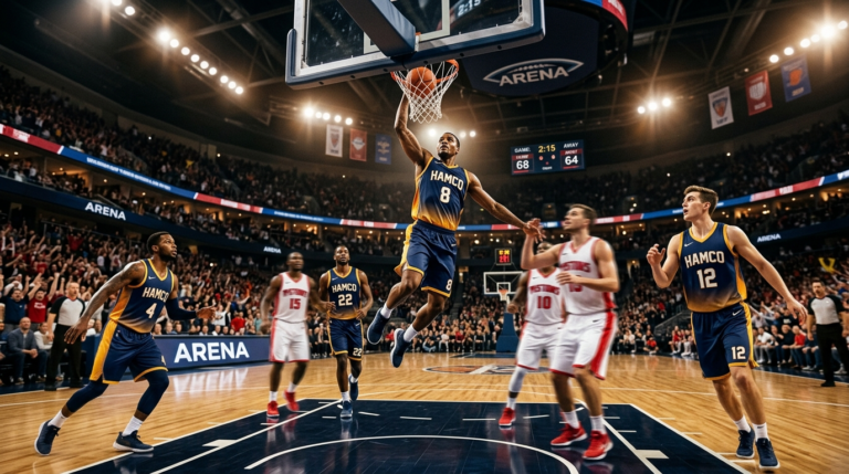
Your basketball jersey design says more about your program than your record does. It’s the first thing opponents notice, the first thing parents photograph, and the first thing recruits remember. Get it right and your team walks onto the floor already looking like it belongs.
This guide walks you through how to build a basketball jersey design that holds up under bright gym lights, on phone cameras, and against teams with bigger budgets than yours.
What makes a great basketball jersey design?
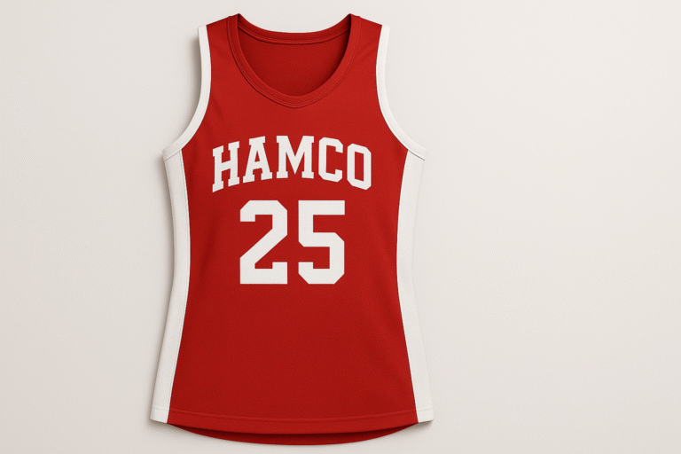
A strong basketball jersey design comes down to five things working together: a high-contrast color palette, readable typography, balanced layout, breathable sublimated fabric, and consistent fit across the roster. Skip any of these and the whole design feels off.
What basketball jerseys ask of a design (that other sports don’t)
Basketball uniforms are uniquely exposed. There’s no helmet covering the head, no shoulder pads hiding the silhouette, no jacket layered on top. Every seam, font choice, and color combination is fully visible from the cheap seats and the courtside camera.
If you want a deeper look at which palettes work hardest for team sports, our breakdown of the best jersey color combinations covers what photographs well and what falls flat.
That visibility cuts both ways. A clean design elevates a program that’s still building. A sloppy one makes a championship roster look amateur. So when you sit down to plan your jersey, you’re not just picking colors. You’re deciding how your team gets perceived for the next two or three seasons.
The five elements every solid basketball jersey design gets right
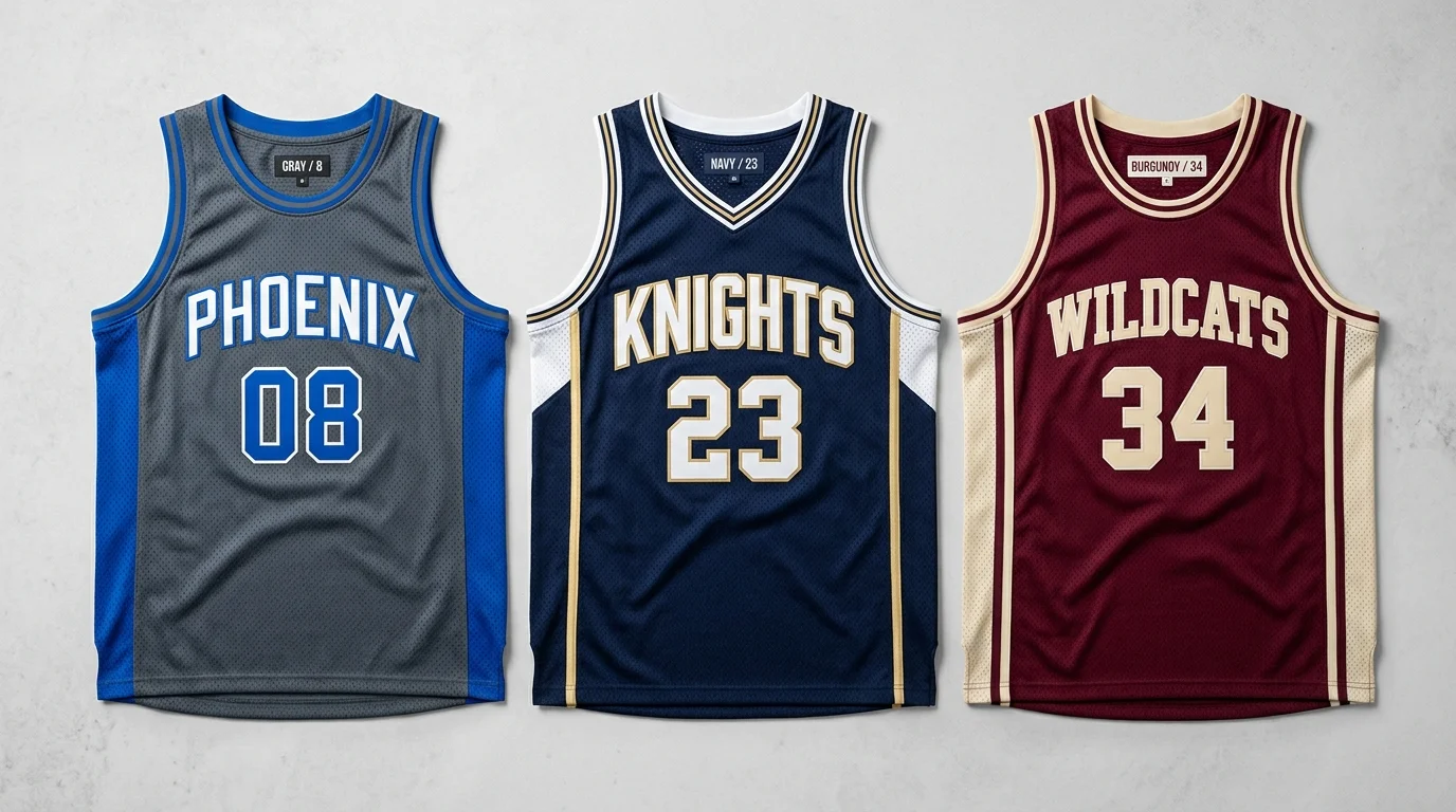
1. A color palette that photographs well
Two colors work. Three colors work if you commit to a clear hierarchy (one primary, one secondary, one accent). Four colors almost never work.
The classic combinations stay popular because they hold up under any lighting: navy and white with gold accents, black and red with silver, royal blue and white with orange. If you want something more current, slate gray with electric blue, burgundy with cream, or hunter green with bone white all photograph cleanly without looking trendy.
One tip most guides skip: test your color combo on a phone screen before approving it. If it looks muddy on a small display, it’ll look muddy in every Instagram post your team gets tagged in.
2. Typography that reads from the back row
Your numbers need to be legible from 50 feet away. Block fonts and modern condensed sans-serifs work best. Avoid heavily stylized scripts or anything with excessive serifs on the numbers themselves. Save the personality for the team wordmark across the chest.
For wordmarks, custom-drawn lettering or a strong italic block reads as more premium than any default Microsoft Word font. If you can’t commission custom types, fonts like League Gothic, Bebas Neue, or United Sans get most of the way there.
3. Layout that respects the body
The chest wordmark should sit roughly two inches below the collar. Numbers on the front are usually smaller than numbers on the back (4 to 6 inches versus 8 to 10 inches). Side panels, when used, should taper or follow the natural curve of the torso, not cut straight down like a strip of tape.
A common mistake here is oversized graphics. A logo that takes up the whole chest looks loud in the mockup but childish in person. Restraint is what makes a design look built rather than slapped together.
4. Materials and construction
Most modern jerseys are sublimated polyester. The dye becomes part of the fabric, so designs don’t crack, peel, or fade the way old screen-printed jerseys did. Sublimation also opens up unlimited color and pattern options without raising the price per jersey.
Look for fabric weight around 140 to 160 GSM for adult jerseys. Lighter fabric breathes better but tears more easily on rebounds. Heavier fabric holds its shape but feels hot during summer tournaments.
5. Fit that works for your actual roster
Cuts run two main ways: standard athletic fit (slightly relaxed) and modern competitive fit (tapered through the torso). Tapered fits look sharper but punish players outside the average build. If your roster has a mix of body types, a standard cut keeps everyone comfortable.
Always order a fit kit or sample before committing to 15 jerseys. The cost of one sample is nothing compared to reordering a full set.
Sublimation basketball jersey design: why it changed everything
Sublimation basketball jersey design is the default now for one simple reason: you can do almost anything with it. Gradients, photographic patterns, full-color logos, intricate side panels, custom inside-collar tags. None of it adds cost the way it would with stitched twill or screen printing.
For teams, that means a few practical advantages worth understanding.
The first is design freedom without a budget penalty. A jersey with a complex gradient costs the same as a jersey with two flat colors. Use that freedom to make your design distinctive instead of safe.
The second is a lighter feel on the body. No heavy stitched patches, no thick screen-print layers. Players wear the design rather than carry it.
The third is durability over time. Properly sublimated jerseys hold their color through hundreds of washes. Screen-printed jerseys start fading after one season of regular use.
The tradeoff is that sublimation requires good source files. A grainy logo or a poorly drawn font will show every flaw. If your team logo was made in PowerPoint a decade ago, this is the moment to redraw it cleanly.
If your team logo was made in PowerPoint a decade ago, this is the moment to redraw it cleanly, and our free sports logo maker walks you through building a clean, sublimation-ready mark without hiring a designer.
Unique basketball jersey design ideas worth borrowing
If you want a unique basketball jersey design that doesn’t look like every other team in your league, the ideas below are good starting points. Pick one or two, not all of them.
City-edition style storytelling
Pro teams made this approach mainstream: jerseys that reference something specific about the team’s location or identity. A coastal town might use wave patterns subtly worked into the side panel. A mountain school could pull a topographic line into the wordmark backdrop. The story doesn’t need to be obvious. It just needs to be there.
Asymmetric design elements
Most jerseys mirror perfectly left to right. Breaking that symmetry with an angled side stripe, an offset chest graphic, or a single shoulder accent makes a design instantly more modern. Use sparingly. One asymmetric element per jersey is enough.
Custom inside-collar tags
The inside of the back collar is wasted space on most jerseys. Programs that care about details put a small phrase, motto, or graduation year inside. Players notice. Recruits notice. It’s the kind of touch that doesn’t show up in mockups but changes how the team relates to the kit.
Gradient fades
A subtle gradient running from the shoulders down to the hem, or a faded color block on the side panel, looks expensive and only works because of sublimation. Used on a third-color set or alternate jersey, it gives your team something visually different for big games.
Pattern overlays
Faint geometric or organic patterns layered under the main design read as premium up close while looking solid from a distance. Honeycomb, brushstroke, halftone, and faint pinstripe patterns all work. The key word is faint. If the pattern is the first thing you notice, it’s too strong.
Mistakes that ruin otherwise solid designs
After enough seasons of seeing what works and what doesn’t, a few errors keep showing up.
The first is trying to put everything on one jersey. Team name, mascot, city, year, motto, sponsor, player nickname. If you can’t decide what’s most important, the design will tell people you couldn’t.
The second is numbers too thin to read. A trendy thin number font looks great in the mockup. From the bleachers, it disappears into the jersey color. Stroke weight matters more than personality.
The third is a color mismatch between jerseys and shorts. Order both pieces from the same supplier in the same production run. Slight color variations between manufacturers are almost guaranteed and look unprofessional once the team is in motion.
The fourth is ignoring the home and away pairing. Your light and dark sets should look like two versions of the same family, not two unrelated designs. Use the same wordmark, the same number font, the same panel structure. Just flip the color logic.
The fifth is approving the mockup too fast. Sit with the mockup for 24 hours before signing off. Look at it on a phone, on a laptop, and printed on regular paper. Designs that look great on a big screen sometimes fall apart at small sizes.
Practical ordering tips most teams learn the hard way
Sublimated production usually takes 2 to 3 weeks from final approval. Add another week for shipping. Plan to have jerseys in hand at least seven days before your first game so you have time for fit corrections.
Lock your roster before you order. Adding three jerseys two weeks later usually means a second production run and a second shipping fee.
Get a name and number list signed off by every player or parent. Misspellings happen, and once the dye is on the fabric, the only fix is reprinting.
For youth and high school programs, check league rules on uniform specs before designing. Some leagues have minimum number sizes, restrictions on advertising, and specific rules for color contrast between numbers and jerseys.
Bringing it all together
A great basketball jersey design is not an accident. It comes from a few smart decisions made in the right order: pick a palette that photographs well, choose typography that reads at distance, lay out the elements with restraint, build it on sublimated polyester, and fit it to your actual roster. Programs that follow that path end up with uniforms players want to wear and opposing teams remember.
Ready to turn an idea into a finished kit? Browse the custom basketball uniforms collection to see jersey styles, shorts pairings, and reversible builds, or request a free mockup to start with your own concept. [INTERNAL LINK: free mockup request page or design tool]
Frequently asked questions
What makes a unique basketball jersey design stand out?
A unique basketball jersey design usually combines one distinctive element (an asymmetric side panel, a custom wordmark, a subtle pattern overlay) with restraint everywhere else. The mistake most teams make is piling on too many ideas. One or two memorable touches set against a clean base reads as confident. Five competing ideas read as cluttered.
Is sublimation basketball jersey design better than traditional printing?
For most teams, yes. Sublimation basketball jersey design allows unlimited colors and patterns without raising cost, holds up better over time, and feels lighter on the body. Traditional screen printing or stitched twill still has a niche for retro-style jerseys, but for modern competitive play, sublimation is the standard.
How long does it take to design and order custom jerseys?
Plan on 4 to 6 weeks total. Initial design and revisions typically take 1 to 2 weeks. Sublimated production runs 2 to 3 weeks after final approval. Shipping adds another 5 to 7 days. Rush options exist but usually add cost.
How much does a custom basketball jersey design cost?
For sublimated team sets, expect somewhere between $40 and $80 per jersey at typical team quantities, depending on fabric weight, design complexity, and order size. Larger orders get better per-piece pricing. Mockups and design work are usually free with a confirmed order.
Can I change my basketball jersey design every season?
You can, but it’s worth thinking about whether you should. Programs that change their design every year never build visual identity. Most successful programs keep their core design for 3 to 5 seasons and rotate alternate or city-edition jerseys for variety.