The right jersey color combinations can make your team look credible before the first whistle blows. They affect how opponents see you, how fans remember you, and how your players carry themselves on the field. This guide breaks down the best jersey color combinations for every major sport, for both men and women, so you stop guessing and start ordering.
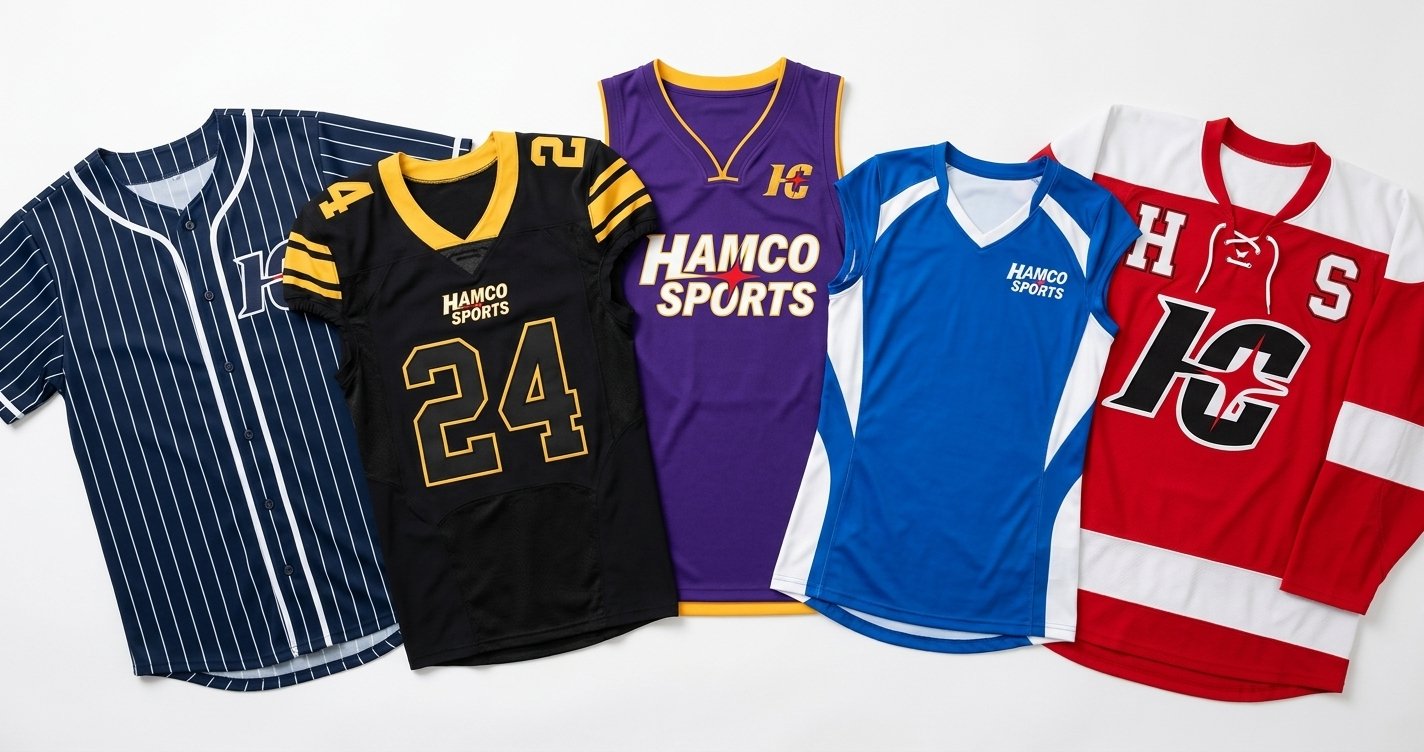
The best jersey color combinations follow a simple formula: one dominant base color, one strong contrast color, and one accent. Keep it to three colors max. High-contrast pairs like black/gold, navy/white, and red/grey read clearly from the stands, on camera, and under any lighting condition.
Best Jersey Color Combinations by Sport: At a Glance
| Sport | Best Combinations | Trending in 2026 | Avoid |
| Baseball | Navy/White, Red/Grey | Forest Green/Cream | Black/Brown |
| Football | Black/Gold, Blue/Orange | Charcoal/Neon Yellow | Yellow/White |
| Basketball | Purple/Gold, Black/Red | Burgundy/Gold | Light Grey/Light Grey |
| Soccer | Red/White, Sky Blue/White | Burnt Orange/Dark Navy | Similar tone pairings |
| Volleyball | Electric Blue/White, Black/Gold | Magenta/White | Yellow/White |
| Hockey | Red/White, Black/Gold | Dark Teal/Silver | Off-white/Cream numbers |
| Men (General) | Navy/White, Black/Gold | Charcoal/Neon Accent | 4+ colors |
| Women (General) | Teal/White, Burgundy/Gold | Dusty Rose/Charcoal | Pale pastels under gym lights |
Best Jersey Color Combinations Start With One Rule
Three colors. That is your limit.
One base. One contrast. One accent. Every team that tries to squeeze in a fourth or fifth color ends up with a jersey that looks busy from ten yards away and impossible to reproduce cleanly on photos, merchandise, or highlight reels.
Look at the teams with the most recognized jerseys in sports history. Chicago Bulls: red, black, white. Golden State Warriors classic: royal blue, gold, white. Brazil national soccer: yellow, green, blue. Three colors, clean separation, instant recognition.
That is not a coincidence. It is a design principle every competitor in your league is probably ignoring. Use it.
Why Jersey Colors Affect Performance (Not Just Looks)
Color psychology in sports is well-documented. Red is associated with dominance and aggression. Navy and dark blue signal authority and discipline. Black projects power. Neon shades communicate speed and energy, which is why you see them across youth athletics and newer team brands.
But here is something none of your competitors mention: how your jersey looks on a phone camera.
Youth league games, travel ball tournaments, and rec sports are all being filmed and shared constantly. Recruiters watch game footage on laptops. Parents post highlight clips on social media. A jersey that looks sharp in person can wash out entirely under stadium floodlights or gymnasium fluorescents when shot on a phone.
Pale yellow on white. Light grey on light grey. Cream on off-white. These are combinations that disappear on video even when they look fine in a store.
Before you finalize your order, hold your jersey under artificial light and film it on your phone. Watch it back. What you see is what everyone else sees all season long.
If you want to know why some jersey colors print differently than they look on screen, read our breakdown of how sublimation printing before you finalize your order.
Baseball Jersey Color Combinations
Baseball has the most tradition-bound visual identity of any American sport. Going too modern can actually work against you because the sport’s culture is tied to classic palettes. Going too safe leaves your team invisible in a sea of navy and white.
When it comes to the best jersey color combinations for baseball, tradition and contrast are everything. Navy and white is the safest starting point for a reason. It photographs clean, reads from the back row, and signals credibility at every level from Little League to travel ball. Add red as your accent and you have one of the most recognized palettes in American sports.
Red and grey is a strong alternative, especially for teams wanting to distinguish home and away kits. True red on a home white jersey, grey on the road. Simple, timeless, and sharp.
Forest green and cream is the most interesting baseball combination trending in 2026 for custom leagues. It reads as vintage without trying too hard, and it is genuinely rare on most fields. If your team wants to be the one people notice and remember, this is where to look.
What to avoid: black paired with brown. It photographs as one muddy color and becomes unreadable on dirt infields under overcast skies.
Looking to order custom baseball uniforms for your team? custom baseball jerseys and get a free mockup in 12 to 24 hours
Football Jersey Color Combinations
Football jerseys face two brutal tests. Friday night stadium lights and broadcast cameras that cut fast. If your colors do not hold contrast under both conditions, your team will look sloppy on film even when the play is clean. Choosing the best jersey color combinations for football starts with one question: will this read clearly at full speed under floodlights?
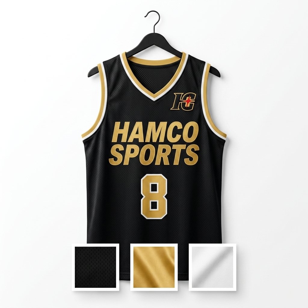
Black and gold is the most powerful football pairing in the sport. It reads as dominant and controlled. Gold does not mean yellow here. True gold, the kind you see on a properly printed sublimated jersey, is warm and metallic. Yellow is flat. Know the difference before you order.
Blue and orange work because they sit directly across from each other on the color wheel. The contrast is natural and energetic. For youth football teams, this combination reads as competitive without being intimidating, which matters when parents are picking leagues for their kids.
Royal blue and white is the most versatile starting point for any new football program. Easy to produce as a matched home and away set. Clean in photos. Recognized at every level.
One combination generating real interest in custom football leagues right now: charcoal and neon yellow. Dark base, serious intention, neon accent that makes every player trackable on film even in low-light stadium conditions.
Basketball Jersey Color Combinations
Basketball jerseys are seen at close range constantly. Fans in the arena are a few feet from the court. Cameras are on the players’ faces. The design has to work at arm’s length and from the upper deck at the same time.
Purple and gold reads as premium. It signals that your team takes itself seriously. The Lakers built a global identity on it, but it works just as well for a local rec league team that wants to stand out without copying a pro franchise exactly.
Black and red is the most aggressive combination in basketball. It says your team is here to compete, not just participate. For school teams and travel programs, it photographs well under gym lighting and stays readable throughout a full game’s worth of action.
Burgundy and gold is one of the most underrated basketball jersey combinations available. It photographs warmly, it is uncommon enough to stand out in a regional tournament, and it works extremely well with sublimation printing. If you want your team to look different from every other squad in black or blue, this is a serious option.
For women’s basketball teams specifically: teal and white has become a strong and distinct choice. It is not trying to be a men’s color palette. It holds well under gymnasium lighting. It photographs with clarity and warmth.
Soccer Jersey Color Combinations
Soccer kits get seen in outdoor natural light, on artificial turf under floodlights, and in photographs and videos shared globally. The sport has more visual design freedom than almost any other, because the culture supports it. Finding the best jersey color combinations for soccer means balancing global readability with something your team actually owns visually.
Red and white is the most universally recognized soccer pairing. Half the legendary clubs in the world built their identities on it. It is readable from any camera angle.
Sky blue and white carries an elegance tied to some of the sport’s most storied clubs and national programs. For youth soccer leagues, it is approachable, easy to pair with white or black shorts, and looks clean in team photos.
Burnt orange and dark navy is the combination worth paying attention to in 2026 for custom soccer programs. It is unusual. It photographs with warmth under natural light. And it gives your team a genuinely distinct identity when every other squad in your league is wearing red or blue.
One practical point that no competitor mentions: your jersey and shorts are always seen together in soccer. Pick colors where they do not compete. If your jersey is busy, anchor it with solid black or white shorts. If your jersey is clean and simple, you have more flexibility in the shorts choice.
Want a kit your team actually owns visually? custom soccer uniforms with full kit customization, no minimum order, and a free mockup.
Volleyball Jersey Color Combinations
Volleyball is played almost entirely under gymnasium fluorescent lighting. That changes everything. The best jersey color combinations for volleyball are ones that stay saturated and readable under artificial light, not ones that look great in sunlight and go flat inside.
Electric blue and white handles gym lighting better than almost any other pairing. The blue stays saturated under artificial light and does not shift toward grey or purple the way some shades do.
Black and gold carries the same authority in volleyball that it does in football. It does not wash out under gym lights. It photographs with strong contrast. And it works for both men’s and women’s programs without needing adjustment.
For women’s volleyball teams: magenta and white is gaining real traction in 2026. It is visually distinct from the typical blue, red, and black options most programs default to. It photographs with clarity. And it gives your team an identity that stands on its own.
Avoid yellow and white in volleyball specifically. Under gymnasium lighting, yellow shifts toward cream and the contrast with white drops to nearly nothing. Referees have a harder time reading numbers. It is a mistake that only becomes obvious on game night.
Hockey Jersey Color Combinations
Hockey jerseys face extreme conditions. Harsh rink lighting, fast camera movement, and the challenge of reading numbers on a player moving at high speed across white ice. Contrast has to be extreme or the jersey fails. The best jersey color combinations for hockey are always the ones with the sharpest possible separation between base and number color.
Red and white is the gold standard for hockey readability. It shows up from every angle, on every camera cut, under every rink lighting setup.
Black and gold gives hockey teams a dominant visual identity. It reads as serious and polished in team photos and on the ice.
For recreational and adult hockey leagues building a fresh identity: dark teal and silver is an increasingly popular option. It feels modern, it photographs well, and it is rare enough that your team will not look like anyone else in the league.
One tip specific to hockey that no other guide mentions: test your number color against your jersey base in a dimly lit photo before you finalize. Hockey arenas vary wildly in light intensity. White numbers on an off-white or cream jersey become nearly invisible under certain rink conditions. That is a problem you cannot fix once the jerseys are printed.
Unique Jersey Color Combinations Worth Trying in 2026
If your goal is to build a team identity that people actually remember, these are the best jersey color combinations generating the most interest in custom sports apparel right now.
| Combination | Best Sport | The Vibe It Sends |
| Olive Green / Off-White | Baseball, Soccer | Vintage, grounded, intentional |
| Dusty Rose / Charcoal | Women’s programs | Bold, modern, immediately memorable |
| Slate Blue / Copper | Basketball, Football | Premium, designed, not off-the-shelf |
| Forest Green / Cream | Baseball, Volleyball | Classic with a fresh twist |
| Burnt Orange / Dark Navy | Soccer, Football | Warm, fierce, genuinely rare |
Olive green and off-white delivers a vintage, grounded look that works particularly well for baseball and soccer. It reads as intentional and distinct, and it is rare in most fields.
Dusty rose and charcoal is a bold move for a women’s program. Unexpected, modern, and immediately recognizable. It photographs with warmth and does not rely on the same red/pink palette that most women’s programs use.
Slate blue and copper is emerging across custom sports apparel as a premium-feeling combination. Copper in sublimation printing picks up light in a way standard gold does not. The result is a jersey that looks designed rather than picked from a generic catalog.
These combinations work because they are rare. When every team in your league is wearing navy or red, stepping onto the field in something genuinely different is its own kind of advantage.
Jersey Color Combinations for Men and Women
The mechanics of choosing a color combination are the same regardless of who is wearing the jersey. Contrast, legibility, and the three-color maximum apply across the board. But starting points often differ.
| Men’s Programs | Women’s Programs | |
| Preferred Base Colors | Black, Navy, Forest Green, Charcoal | Teal, Burgundy, Magenta, Violet |
| Top 2026 Trending Combo | Charcoal / Neon Yellow | Dusty Rose / Charcoal |
| Classic Safe Choice | Navy / White | Teal / White |
| Lighting Consideration | Holds well under any condition | Avoid pale pastels under gym/field lights |
| Photography Performance | Dark bases photograph cleanly all season | Jewel tones photograph with warmth and depth |
Men’s programs historically lean toward darker base colors: black, navy, forest green, charcoal. These read as authoritative and hold up across a long season without looking tired in late-season team photos.
Women’s programs have more cultural room to build with a wider palette, and the smartest coaches and team managers are using that. Deep teal, burgundy, violet, and magenta are all gaining ground because they create genuine visual identity instead of defaulting to softer pastels that often wash out under gym or field lighting.
One thing to avoid for both: choosing colors based on what is cheapest or fastest to stock. Your colors are your team’s brand. They stay on your jerseys, your warmups, your bags, and your photos for years. Pick what works, then find a manufacturer who can produce it right. Custom sublimation printing means color is never a limitation.
The Mistake That Costs Teams Every Season
They pick colors they love. They approve a digital mockup. They order. And then the jerseys arrive and the red looks more like burgundy, the gold looks more like yellow, or the numbers are nearly invisible against the base. Picking the best jersey color combinations on screen means nothing if the final print does not match.
Always request a physical sample or a printed proof before committing to a full order. At Hamco Sports, every custom jersey order includes a design proof so your team sees the exact colors before a single jersey ships. That one step eliminates the most common and most expensive jersey mistake we see every season.
Build your custom jersey at hamcospo.com. Request a free proof, browse sport-specific catalogs, and get your team into colors that actually work.
Frequently Asked Questions
What are the best jersey color combinations for baseball teams?
Navy and white, red and grey, and forest green and cream are the strongest choices for custom baseball jerseys. They photograph cleanly, hold up across a full season, and communicate credibility at every competitive level.
What are unique jersey color combinations no one else is using?
Olive and off-white, dusty rose and charcoal, and slate blue and copper are all generating strong interest in 2026 for custom sports programs. They are rare on most fields and immediately memorable.
What are the best football jersey color combinations for youth leagues?
Royal blue and white is the most versatile starting point. It produces well as a matched home and away set, photographs cleanly for team photos, and works for both men’s and women’s programs without adjustment.
What basketball jersey color combinations work best for women’s teams?
Teal and white, magenta and white, and burgundy and gold all photograph warmly, hold well under gymnasium lighting, and create a distinct visual identity separate from the standard red, blue, and black options most programs use.
What hockey jersey color combinations are most visible on the ice?
Red and white and black and gold are the most readable under rink lighting and on broadcast cameras. For programs building a fresh look, dark teal and silver is a strong modern option, but always test number legibility under low-light conditions before finalizing.