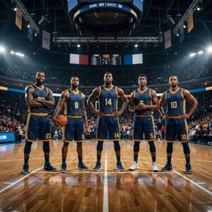
A great basketball uniform doesn’t just look good on the hanger. It reads clearly from the top row, photographs well under arena lighting, and holds up after sixty washes. Get it right and your program’s identity compounds, season after season. Get it wrong and you’re stuck staring at a $4,000 set that already looks dated.
This guide walks through basketball uniform design the way an experienced art director would approach it: starting with the visual system, moving through typography and color, and ending with the production decisions that make or break the final product. Whether you’re outfitting a youth rec league, a travel program, a high school varsity squad, or an adult league, the same design principles apply. Only the constraints change.
By the end of this guide, you’ll know how to build a cohesive uniform from scratch, what’s actually trending in basketball jersey design in 2026, which color combinations hold up under stadium lighting, and the common mistakes that quietly ruin otherwise solid designs.
Why Basketball Uniform Design Is Different From Any Other Sport
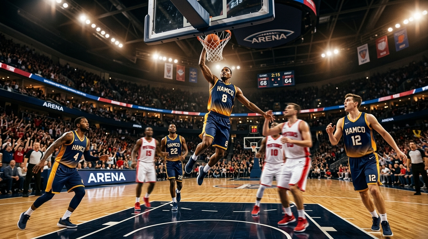
Basketball is the most visually exposed team sport there is. No helmets. No pads. No caps pulled low. Just a jersey, shorts, and five players on each side, all clearly visible to every seat in the gym at the same time.
That visibility changes everything. In football, a mediocre uniform is hidden under padding and a helmet. In baseball, the hat does half the aesthetic work. In basketball, every graphic, every font, every seam is on display, and the camera is usually close enough to see it. That’s why basketball uniform design leaves no room for shortcuts, poorly proportioned designs expose themselves immediately, while well-executed ones elevate the entire program.
Three constraints flow from this:
- The jersey and shorts have to function as a single outfit. A gorgeous jersey paired with generic shorts looks like a mismatched thrift-store find. Always design the set together.
- Every graphic has to work in motion. A logo that looks sharp in a flat mockup can disappear when a player is sprinting down the court. Test your design against blur, distance, and low-light arena photography.
- Contrast is non-negotiable. Referees need to read numbers from 50 feet away. Opponents need to identify teammates. Spectators need to recognize players from the upper deck.
Keep these three in mind and you’re already ahead of most amateur basketball uniform design attempts.
The Basketball Uniform Design Process: 7 Steps
Most people start with “I want it to be blue.” Better designers start with the end state and work backwards. Here’s the workflow that produces cohesive sets instead of collage-like messes.
Step 1: Define the program identity first
Before you pick a single color, answer three questions: Who is this team? What do they want to communicate? And how do they want to be remembered? A youth rec program wants warmth and accessibility. A prep school varsity wants tradition and prestige. A travel AAU program wants energy and relevance. Every subsequent design decision should ladder back to that identity.
Step 2: Lock your color system
Pick a dominant color, a secondary accent, and one trim color. That’s it. Three colors maximum. Budget palettes and premium palettes alike fail when designers try to force a fourth.
Step 3: Choose a jersey silhouette
Sleeveless (traditional, breathable, max mobility) versus short-sleeve (more graphic real estate, modern feel) versus reversible (two designs in one, budget-friendly). Pick based on your program’s vibe, not on what’s trendy this minute.
Step 4: Design the graphic system
Side panels, waistband treatments, chest wordmarks, shoulder piping. Decide which elements carry the design and which stay clean. The most common mistake here is decorating every surface. Restraint photographs better.
Step 5: Plan typography for name and number
Numbers first, names second. Numbers should be readable from any seat in the building. Names should complement the numbers without fighting them for attention.
Step 6: Extend the system to the shorts
The shorts are not a separate garment. They’re the bottom half of the same outfit. The waistband, side panels, and hem should echo elements from the jersey.
Step 7: Mock up home and away together
Home is usually light-body with dark accents. Away flips the relationship. Designing both at once forces consistency. Designing them separately is how you end up with two uniforms that look like they came from different teams.
Work through these in order and you’ll land on a basketball uniform design that feels intentional instead of accidental.
Basketball Uniform Design Trends 2026
Basketball jersey design trends in 2026 are pulling from three places: NBA City Edition aesthetics, streetwear silhouettes, and the broader return of expressive, maximalist sportswear. A few specific directions are dominating this year.
Gradient fades. Jersey bodies that transition from one team color into another (navy into electric blue, crimson into burnt orange, forest green into lime) were once exclusive to NBA City Edition drops. Sublimation has made them accessible at every budget level, and they photograph beautifully in action.
Asymmetric side panels. Instead of mirrored left/right panels, 2026 designs are running curved or angled color blocks on one side only. The result is a jersey that reads differently depending on which way a player is moving, a subtle detail that makes broadcast footage feel premium.
Heritage typography. After a decade of modern condensed sans-serifs, collegiate block fonts and mid-century serifs are back. Programs are pairing vintage wordmarks with contemporary silhouettes, which creates a “timeless but current” effect.
Muted earth palettes. Cream, clay, forest, rust, slate. The saturated neon era is cooling off. Expect more teams to build 2026 basketball uniform designs around desaturated tones with one high-chroma accent.
Full-sublimation patterning. Geometric patterns, topographic lines, and subtle camo textures running across the full jersey body, previously a pro-level production choice, are now standard at the high school and AAU level.
Minimalist “blank canvas” looks. On the opposite end, the cleanest 2026 designs are stripping back to a single wordmark, simple numerals, and one accent stripe. When executed with attention to proportion, these quiet designs often outperform the loud ones.
If you’re choosing between these directions, default to the one that reinforces your program identity from Step 1, not the one that looks coolest in isolation.
Basketball Jersey Design 2026: Color Combinations That Actually Work
Most basketball uniform color combinations fall apart for one of two reasons: the contrast is too weak to read at distance, or the palette is too busy to feel cohesive. Here are combinations that avoid both traps.
Classic combinations (high contrast, always readable)
- Navy + white + gold. The safest premium palette in sports. Reads clearly under any lighting, ages well, works for programs at any level.
- Black + red + white. Aggressive, high-energy, universally recognizable. Works especially well for travel programs and competitive high school teams.
- Forest green + cream + gold. A heritage palette that feels prep-school polished without being stiff.
- Royal blue + orange + white. High-energy, youthful, reads beautifully under bright lights.
Modern 2026 combinations
- Slate gray + electric blue + black. Clean, contemporary, tech-forward.
- Burgundy + dusty pink + cream. Unexpected, editorial, stands out in a sea of primary colors.
- Charcoal + safety orange + white. Industrial and aggressive. Great for programs that want a darker aesthetic.
- Deep teal + coral + off-white. Feels fresh, photographs well, works especially on gradient fades.
Combinations to avoid
- Three high-saturation colors together (visual chaos).
- Two colors with similar brightness values (poor contrast from distance, since the jersey will look muddy on broadcast).
- Trendy palettes that don’t match your program identity (every uniform gets dated eventually; the question is whether it was ever “yours” in the first place).
Pick your palette before you pick your graphics. Graphics can be changed; a wrong color system reveals itself every game for four years.
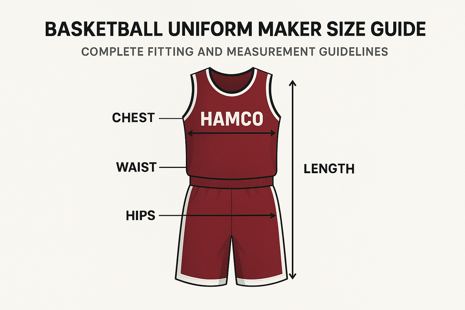
Typography: Numbers and Names That Read From the Back Row
Jersey typography is where most amateur basketball uniform designs fall apart. Numbers are too thin, names are too ornate, or the two fonts fight each other. Three rules will eliminate 90% of typography problems.
Rule one: Numbers come first. Pick the number font, lock it in, then choose a name font that complements it. Never the other way around. Numbers are the most critical piece of identifying information on the entire uniform.
Rule two: Numbers need weight. Size matters (5 to 7 inches for youth jerseys, 7 to 9 inches for adult), but weight matters more. Thin or overly stylized numbers disappear at distance. Use bold, geometric numerals with a stroke thickness of at least 0.75 inches on adult jerseys. Add a contrasting outline if the jersey body is visually busy.
Rule three: Names stay simple. Uppercase, condensed, 2 to 3 inches tall, arched or straight across the shoulder blades. Save the expressive typography for the team wordmark on the chest. The name on the back of the jersey is for identification, not personality.
Typography pairings that consistently work: collegiate block numerals with a condensed sans-serif name font; modern geometric numerals with an all-caps sans for the name; vintage serif numerals with a matching serif name treatment for heritage looks.
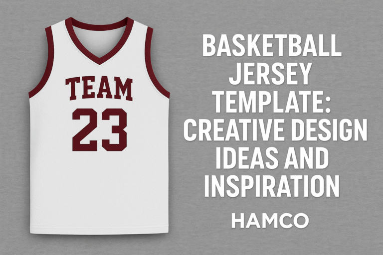
Best Basketball Jersey Design 2026: Templates and Inspiration
Looking at great work is the fastest way to train your eye. When you’re scouting reference, pull inspiration from four places:
NBA City Edition uniforms. The league’s experimental edition is where graphic designers push into gradient fades, unexpected color stories, and culturally-specific motifs. Steal the ideas, not the literal designs.
European professional basketball. Teams like Anadolu Efes, Maccabi Tel Aviv, and Panathinaikos consistently produce basketball jersey designs that are more graphically adventurous than their American counterparts, especially around side-panel treatments and wordmark typography.
College basketball throwback jerseys. College programs have been mining their own archives for four straight seasons, and many of the resulting designs have become modern classics. Look at what North Carolina, Kansas, and Duke have put on the court recently.
Design portfolios on Dribble and Behance. Search “basketball jersey design 2026” and you’ll find hundreds of concept pieces from designers worldwide. Many are unproduced concepts, which means the ideas are fresh, and you can pull structural inspiration without copying an existing team’s identity.
When you find a reference you love, ask why it works before you adapt it. Is it the palette? The asymmetry? The typography pairing? Naming the mechanism is what separates copying from actually learning design.
Jersey Style Choices: Sleeveless, Short-Sleeve, and Reversible
Sleeveless jerseys
The default for competitive basketball at every level, from youth rec to the NBA. Maximum mobility, maximum breathability, and the cleanest silhouette. If you have any doubt about which style to pick, pick sleeveless.
Short-sleeve jerseys
Offers more graphic real estate on the sleeves and a different silhouette. Popular for shooting shirts, alternate uniforms, and programs that want a modern streetwear feel. The tradeoff is slightly reduced shoulder mobility and a warmer feel during high-intensity play.
Reversible jerseys
Two designs in one jersey: one colorway on the inside, one on the outside. The player flips the jersey to switch between home and away looks. Reversible construction is the single best value in basketball uniform design. You’re essentially buying two jerseys for the price of one.
The design catch: you have to coordinate two complete color schemes in one piece. The cleanest reversible designs use a light side and a dark side that share the same graphic skeleton (same side-panel shape, same chest wordmark placement, same number font) in inverted color relationships. Player name and number need to read on both sides.
Reversible are especially popular for youth rec leagues, scrimmages, and budget-conscious programs. They’re less common at the varsity and travel level, where programs typically prefer dedicated home and away sets.
Shorts Design: The Other Half of the Uniform
Shorts are the half of the uniform most designers neglect, which is exactly why thoughtful shorts design is such an easy way to separate your program’s look from the generic templates you’re competing with.
The strongest shorts designs do three things: they echo the jersey’s color system in the waistband and side panels, they use the side seam as a design opportunity (a stripe, a fade, a contrast panel), and they match the jersey’s hem treatment at the leg opening.
Length matters. Mid-thigh is standard for competitive play in 2026. Shorter retro lengths are having a moment for heritage looks, but always confirm your league’s minimum length regulation before finalizing. Some youth and high school leagues have strict requirements.
Keep the back of the shorts cleaner than the front. Players spend most of the game with their backs to half the spectators, and overly busy back panels photograph poorly.
Common Basketball Uniform Design Mistakes
A short list of the errors I see most often from programs designing their own uniforms:
Too many colors. If you have to ask whether four colors is too many, it is.
Graphics that ignore the center of the jersey. The chest wordmark is the single most visible element on the entire uniform. Treat it like the most important design decision you’ll make, because it is.
Illegible numbers. Thin numerals, low contrast with the jersey body, or fonts that prioritize style over readability. Numbers exist to be read. Everything else is secondary.
Mismatched jersey and shorts. Shorts designed as an afterthought or ordered from a different supplier than the jersey. Always design the full set together.
Over-trending. Designing around a 2026 trend without checking whether it actually fits your program’s identity. Trends age. Program identity compounds.
Skipping the home/away pair. Designing one version and assuming the other will “figure itself out.” It won’t.
Basketball Uniform Design by Level
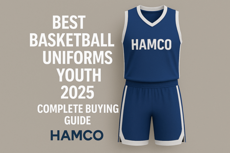
Youth rec leagues
Prioritize durability, clear numbers (kids are small; opponents need to find them fast), parent-friendly pricing, and reversible construction if the league doesn’t provide separate home/away sets. Bright, high-contrast palettes work best for this age group.
Travel and AAU programs
More design latitude, more budget, more emphasis on looking competitive at tournaments. Programs at this level benefit from current basketball uniform design 2026 trends like gradient sublimation, asymmetric side panels, and distinctive wordmark typography. Your uniform should look at home on a tournament floor alongside top-tier opponents.
High school varsity
Heritage matters. Many programs carry visual elements forward across generations. If your school has a classic uniform history, lean into it rather than reinventing from scratch. Parents, alumni, and current players all respond to continuity.
Adult leagues
Self-expression is the whole point. Adult rec teams often skew more graphically adventurous than any other level: custom wordmarks, pop culture references, unusual palettes. Have fun with it.
Ordering Your Team’s Basketball Uniforms
Once your basketball uniform design 2026 is locked, production is straightforward, but timing and spec documentation matter. A few practical notes for a clean handoff:
Allow 2 to 3 weeks for sublimated production from the moment you approve the final mockup. Plan so jerseys arrive at least a week before your first game to leave room for fit corrections. Order a roster sheet with everyone’s name, number, and size before you place the order. Adding players after the fact usually means a second production run.
If you want help turning your design into a finished set, browse the custom basketball uniforms collection for jersey styles, shorts options, and reversible builds. Free mockups come back within 6 to 12 hours of the initial brief, and bulk pricing applies to orders of multiple sets.
FAQ
What’s the best fabric for a basketball jersey?
100% lightweight moisture-wicking polyester, printed via sublimation. The fabric breathes during continuous high-intensity play, the sublimation infuses the graphics permanently into the fibers so nothing cracks or peels, and the combination holds up through hundreds of wash cycles.
What are the best basketball jersey design trends for 2026?
Gradient fades, asymmetric side panels, heritage block typography, muted earth-tone palettes with one high-chroma accent, and full-sublimation geometric patterning are all trending strongly in 2026. Minimalist “blank canvas” designs with a single wordmark and accent stripe are the counter-trend.
How many colors should a basketball uniform use?
Three maximum: a dominant color, a secondary accent, and a trim color. Pushing past three almost always makes the design feel busy and harder to reproduce consistently.
How big should jersey numbers be?
5 to 7 inches for youth jerseys, 7 to 9 inches for adult. The number weight (stroke thickness) matters as much as the size. Thin numerals disappear at distance even when they’re technically large.
Can I put sponsor logos on a basketball uniform?
Yes, sponsor logos can be sublimated onto the chest, back, shorts waistband, or sleeve. Confirm your league’s policy on commercial sponsorship placement before committing. Some leagues cap sponsor placement size or disallow it entirely.
Sizing decisions become even more important for youth teams, where league regulations differ significantly across divisions, our guide to youth basketball rules by age group breaks down what coaches and parents need to know before customizing uniforms.
What’s the difference between reversible and standard jerseys?
Reversible jerseys have a complete design on both the inside and outside, so one jersey functions as both home and away. Standard jerseys have a design only on the outside, which means you need two separate sets for home and away games. Reversible cost more per unit but eliminate the second set entirely.
How long does basketball uniform production take?
2 to 3 weeks from final design approval for sublimated sets. Plan your order timeline so jerseys arrive at least one week before your first game.
What’s the best color combination for a basketball uniform?
Navy, white, and gold is the safest premium palette. High contrast, photographs well, ages slowly. For more modern looks, slate gray with electric blue and black, or burgundy with dusty pink and cream, both perform strongly in basketball uniform design 2026.
A well-designed basketball uniform is an identity, not just an outfit. Take the time to get the system right (the color palette, the typography, the jersey-to-shorts continuity, the home-and-away pairing) and the result is a uniform your players are proud to wear and your program is recognized for years. Ready to turn your design into a finished set? Explore the full range of basketball uniforms to see what’s possible.