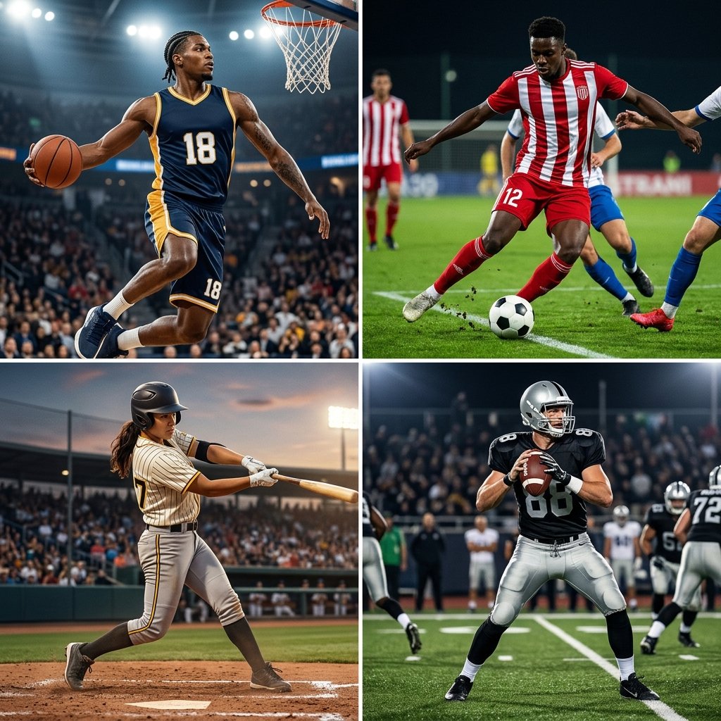
The best team uniform design for a sports team in the United States follows the same five principles, regardless of sport: a disciplined two-to-three-color palette, a strong typography system, a logo that scales across every garment, performance fabric matched to the sport, and an athlete-first fit that holds up across a full season. Everything else is execution.
This is not a listicle about the Yankees pinstripes or the Lakers’ Showtime gold. We covered those in our best uniforms in sports breakdown. This guide is a working playbook for coaches, athletic directors, and team managers who actually have to design a uniform, and want to get it right the first time.
By the end of this guide, you’ll know exactly what makes a uniform work, what kills one, the seven-step process used by experienced designers, how the rules shift across sports, and what to demand from your manufacturer before you place an order.
What Actually Makes a Great Team Uniform Design?
A great team uniform design hits five marks consistently. Miss one and the entire kit feels off. Hit all five and you build something a program wears for a decade.
Identity clarity: Someone who has never seen your team should know who you are within five seconds of seeing the uniform. That comes from disciplined color, a confident logo, and a wordmark that earns its space.
Color discipline: Two colors dominant, one accent, no exceptions. The most enduring uniform designs in any sport follow this rule. The worst is breaking it.
Readability: A referee should be able to read the number from fifty feet under bad lighting. A spectator in the cheap seats should be able to identify which team is which by silhouette and color alone.
Performance fit: A uniform is athletic equipment, not a t-shirt with a logo. Fabric, weight, breathability, and stretch all matter, and they matter differently for every sport.
Longevity: The design has to age well. Trends die fast in sportswear. Trendy uniforms look dated by year three. Disciplined ones look intentional twenty years later.
If your design fails any one of these, fix it before you place the order. The cheapest fix is the one made on the mockup.
The 5 Design Principles Every Great Team Uniform Follows
These are the fundamentals. Skip them and no amount of fabric upgrade will save the kit.
Color discipline: two dominant colors, one accent
Pick a dominant color, a secondary color, and one accent. That’s the entire palette. The Raiders own silver and black. The Cardinals own red. The Celtics own green. None of them needs a fourth color, and adding one would weaken the identity.
Test your colors under stadium lighting before you commit. Some greens go muddy under fluorescents. Some reds shift orange under sodium-vapor field lights. Some blues vanish at twilight. If you can, ask your manufacturer for a fabric sample in the actual color before you sign off on the full order.
Typography: built to be read, not admired
Numbers and names need to be read instantly from a distance. Block fonts are the safest choice and the most widely used in pro sports for a reason.
Script fonts work for chest wordmarks (especially in baseball) but rarely for back numbers. Custom fonts can elevate a uniform (or wreck it) depending on execution.
Whatever you choose, test it at game distance. Print a mockup, tape it to a wall, and walk fifty feet back. If you can’t read the number cleanly, it doesn’t work.
Logo treatment: one strong mark, used consistently
Your logo or wordmark is the anchor of the entire design. Size it correctly for the chest, the cap, and the sleeve panel. Don’t try to fit it into every available inch. Restraint is what makes great logos feel premium. The Red Wings have used the same winged-wheel logo since 1932 because they understood it was already finished.
Fabric and construction: match the sport
Basketball needs lightweight, breathable, max-mobility. Football needs heavier, more abrasion-resistant builds that survive impact. Baseball jerseys need durable wash performance over a long season.
Wrestling singlets need four-way stretch and regulation-compliant single-color construction. The right fabric is not the most expensive fabric. It’s the one engineered for what your athletes actually do.
Sublimation printing has changed what’s possible. Designs that used to require complex stitching or screen printing can now be printed directly into the fabric, which means no peeling, no cracking, and unlimited color options. Read our complete guide to sublimation printing if you want the full breakdown.
Fit and silhouette: design for the athlete, not the fan
This is where most amateur designs fail. They’re designed to look good on a hanger or in a mockup, not on a sprinting athlete. A uniform that looks sharp in a still photo but rides up, bunches, or restricts motion is a failed design no matter how clean the graphics are.
Involve your players in the fit conversation. Order samples. Test in practice before you commit to a full team order.
Color Psychology in Sports Uniform Design
Color is not decoration. It’s a real performance variable backed by sports psychology research.
Red signals dominance: Studies in Olympic combat sports have suggested that athletes wearing red may experience a small competitive edge, likely due to visibility and psychological perception. It’s an aggressive, attention-pulling color, which is exactly why it works for football, wrestling, and rugby.
Blue projects focus and composure: It reads as calm under pressure, which is why it’s a fixture in precision sports and a popular base color across nearly every major American team.
Black projects authority: The Raiders built an entire brand identity around it. Black combines well with almost any accent, which is why it has remained one of the most-used colors in sports for fifty years.
Green communicates composure and balance: It works exceptionally well in baseball, soccer, and precision sports. The Boston Celtics and Oakland Athletics have owned their shade of green for decades.
Yellow and gold create energy and visibility: Used as an accent, they make a uniform pop. Used as a dominant color, they’re risky. Yellow can wash out under stadium lighting and read as orange or white on camera.
The principle: pick colors that align with your program’s identity, not whatever is trending. A youth program building a culture of toughness should not be wearing pastel pink because it photographs well on Instagram.
A women’s volleyball program with a precision-and-poise identity should not be locked into aggressive red because it’s “intimidating.” Match the color to the team you’re actually building.
Design Considerations by Sport
Every sport has its own design constraints. Here’s what changes when you move from one to the next.
Basketball
No pads, no helmets, no obstructions. Every graphic, every seam, every font choice is exposed. The jersey and shorts have to function as a single visual unit. Design them together, never separately. Lightweight, moisture-wicking fabric is non-negotiable.
For a full breakdown of color palettes, fonts, silhouettes, and the 7-step basketball-specific design process, read our complete basketball uniform design guide or browse our custom basketball uniforms lineup.
Baseball
Baseball is the most restrictive design canvas in American sports. You’re working with a button-front jersey, pants in a single color, and a cap. That’s it. The cap does half the aesthetic work, which is why baseball is so cap-driven as a sport. The script wordmark tradition (Dodgers, Tigers, Cardinals) is one of the strongest design conventions in any sport.
Dive deeper in our baseball jersey design ideas guide or shop custom baseball uniforms.
Softball
Softball offers more flexibility than baseball: racerback options, sleeveless cuts, V-necks, and modern fits are all in play. Summer-month heat performance is critical. Throwback design elements (pinstripes, cursive wordmarks) are having a strong moment in 2026.
See our softball team uniform design guide and our custom softball uniforms collection.
Football
The helmet is the brand. Almost every great football program is identified by its helmet first and its jersey second. Color blocking and helmet decals carry more visual weight than any other design element. Heavier fabrics, abrasion resistance, and reinforced stitching matter because the uniform takes a real beating.
Explore custom football uniforms to start building yours.
Soccer
Soccer kit design has its own global vocabulary: kit traditions, sponsor placement, lightweight knit fabrics, and a tighter, more European silhouette than American sports. Home and away kits are designed in pairs and almost always feature inverted color relationships.
Browse custom soccer uniforms for fabric and cut options.
Wrestling
Wrestling is design-by-regulation. Single-color singlets, trim restrictions, sponsor placement rules, and competition-specific requirements from NFHS, NCAA, and UWW all constrain what’s possible. Color discipline is enforced by the rulebook. Your only real design lever is color choice and the wordmark.
Read our full wrestling uniform rules and regulations guide before designing, and shop custom wrestling singlets.
Ice Hockey
Hockey sweaters carry more weight (literally and visually) than any other jersey in American sports. The logo dominates. Words on hockey sweaters are rare and most great teams use a crest. Durability matters because hockey uniforms take more wear than almost any other sport.
See our custom ice hockey uniforms range.
Rugby, Lacrosse, Volleyball, E-sports
Each has its own design conventions worth respecting. Rugby allows hooped designs and bold contrast that would look chaotic in other sports. Lacrosse trends are modern and aggressive: geometric panels, two-tone fades, and high-energy color systems work well. Volleyball needs four-way stretch and fitted silhouettes. E-sports apparel is its own world entirely, drawing more from streetwear than traditional team sports.
Browse custom rugby uniforms, Custom lacrosse uniforms, Custom volleyball uniforms, and Custom e-sports apparel to see what fits your program.
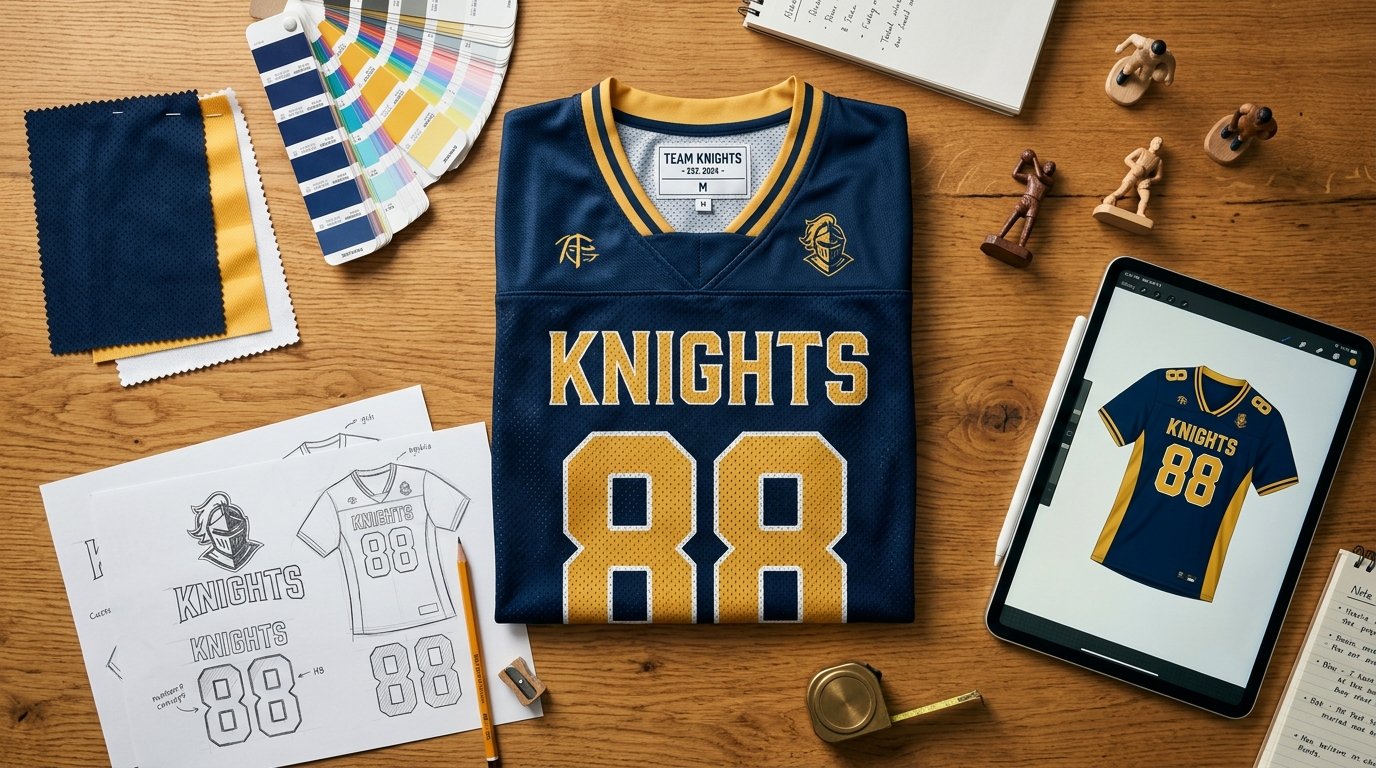
The 7-Step Process to Design a Team Uniform
Every good uniform design follows roughly the same workflow. Skip steps and the kit shows it.
Step 1: Define team identity
Before you pick a single color, answer three questions. Who is this team? What do they want to communicate? How do they want to be remembered? A youth recreation program wants warmth and accessibility. A varsity prep school wants tradition and prestige. An adult travel team wants intensity and presence. Every subsequent design decision should ladder back to that identity. If you skip this step, you’ll end up choosing colors and fonts that feel good in isolation but don’t add up to anything.
Step 2: Choose your color palette
Dominant color, secondary color, accent. Stop there. Test the combination under the lighting your team actually plays in. Look at the colors used by other programs you’ll see at games, tournaments, and showcases. If you’ll constantly be mistaken for another team, change the palette.
Step 3: Select silhouette and cut
Sleeveless vs sleeved. V-neck vs crew. Button-front vs pullover. Reversible vs single-sided. Each decision changes the personality of the uniform and what’s possible graphically. Make these choices before designing the graphic system, not after. The silhouette dictates where graphics can live.
Step 4: Build home and away together
Home is typically light-bodied with dark accents. Away inverts the relationship. Designing them simultaneously forces consistency. Designing them separately is how programs end up with two uniforms that look like they came from different teams.
Step 5: Choose fonts and numbering
Block fonts are the safe choice and the right choice for most programs. Custom or script fonts are higher reward and higher risk. Test for readability at game distance. Make sure the number style works at both two-digit and single-digit sizes (a “1” and an “11” should look like the same uniform, not two different ones).
Step 6: Finalize the logo and wordmark
Decide where the primary logo lives, where the wordmark lives, and where (if anywhere) the secondary mark appears. Sleeve panels, shorts hips, and cap fronts are all available real estate, but use them with restraint. A logo that appears in eight places is a logo no one looks at.
Step 7: Mockup, sample, approve
Never approve a full team order from a flat digital mockup alone. Get a sample. Have a player wear it. Take game-action photos. Check the colors under field lighting. Look at the back number from fifty feet. Wash it. Inspect it again. Then approve the order.
Common Design Mistakes That Ruin an Otherwise Good Uniform
A good design can survive almost anything except these. Avoid all of them.
Too many colors: The single most common mistake. Three is the ceiling. Four is a warning sign. Five guarantees a disaster.
Chasing trends: The 2010s alternates that looked daring in the moment look embarrassing now. Throwbacks dominate in 2026 because timeless designs always win on the long timeline.
Redesigning too often: The Raiders, the Yankees, the Canadiens. None of them changed their core look for decades. That consistency is what built the equity. Programs that redesign every two years never accumulate identity.
Illegible numbers: Stylized number fonts that confuse a 6 with an 8, or a 1 with a 7, are design malpractice. Numbers exist to be read at speed and distance.
Designing for fans, not athletes: A jersey that looks great in a retail mockup but bunches at the waist, restricts shoulder rotation, or holds sweat is a failed uniform.
Copying a pro team: Wearing a near-replica of an NFL or NBA team’s color scheme doesn’t transfer the equity. It just makes your program look like a knockoff.
2026 Team Uniform Design Trends
A snapshot of what’s actually working in sports apparel right now.
Throwbacks are dominant: Heritage looks are winning across the NFL, NBA, MLB, and college sports. Fans and players respond to authenticity. Throwback-inspired youth and varsity kits are seeing the strongest demand in years.
Bold color blocking is replacing busy graphics: High-contrast, low-clutter designs are outperforming complicated patterns at every level.
Sublimation has become the default: Sublimated full-color designs are now standard across most price tiers. Screen printing and tackle twill still have a place, but sublimation handles complexity that older methods can’t touch.
Sustainability is moving from optional to standard: Recycled polyester blends and organic cotton accents are increasingly expected in 2026, particularly at the youth and collegiate levels.
Smart and compression fabrics are coming: Temperature-regulating builds and compression panels designed to reduce muscle fatigue are already in use at the professional level and are starting to filter down to elite amateur programs.
How to Work With a Uniform Designer or Manufacturer
If you’re working with a custom uniform manufacturer, here’s what to bring to the kickoff and what to demand throughout the process.
Bring to the first conversation: your team identity (in one or two sentences), three color references (Pantone codes if possible), examples of three uniform designs you like and one you hate, your sport, your level, your budget per athlete, your delivery deadline, and your roster count.
Demand a real mockup, not a sketch: A good manufacturer will produce a digital mockup showing the front, back, and side of every garment in your kit before any production starts. If you can’t see it, don’t approve of it.
Demand a physical sample: A digital mockup is necessary but not sufficient. Hold the fabric. See the color in real light. Check the print quality. Confirm the fit before committing to a full order.
Demand revisions: A good design rarely lands on the first pass. Two or three rounds of revisions are normal. A manufacturer that resists revisions is signaling that they treat your order as a transaction, not a partnership.
Demand a wash test: Run a sample through ten cycles before approving the full order. Read our jersey washing guide for the proper care protocol, and use it as the test standard.
This is exactly the process our design team uses on every custom order at HAMCO. If you want to see it in action, start a custom order or contact our team for a design consultation.
FAQ
What is the best team uniform design for a sports team in the United States?
The best designs share five qualities regardless of sport: a disciplined two-to-three-color palette, strong and readable typography, a logo system that scales across the kit, sport-appropriate performance fabric, and an athlete-first fit. Specific styles vary by sport (basketball rewards graphic boldness, baseball rewards restraint, football rewards helmet-first identity), but the underlying principles do not change.
How long does it take to design and produce a custom team uniform?
Most custom orders take four to eight weeks from initial design to delivery. Design and revisions typically take one to two weeks, production runs three to five weeks, and shipping adds a few days. Rush orders are possible but expect a premium and reduced flexibility on customization.
How much should a custom team uniform cost?
Budget kits start around $35 to $50 per athlete. Mid-tier custom kits with full sublimation run $60 to $100 per athlete. Premium kits with performance fabric, multi-piece sets, and advanced construction run $100 to $200 or more per athlete. Most youth and high school programs land in the mid-tier range.
How many colors should a team uniform use?
Two dominant colors and one accent. Three colors total is the working limit for almost every successful uniform in sports history. A fourth color almost always weakens the design.
Do uniforms actually affect player performance?
Yes. Sports psychology research on enclothed cognition shows that what athletes wear directly influences confidence, focus, and team cohesion. Well-fitted, professionally designed uniforms produce measurable improvements in player self-perception and team identity, both of which carry into performance.
What’s the difference between sublimation and screen printing?
Sublimation prints the design directly into the fabric using heat and dye, producing a finish that doesn’t peel, crack, or fade. Screen printing applies ink onto the surface of the fabric, cheaper for simple designs but more prone to wear over time. For full-color custom uniforms, sublimation is the modern standard.
Can I design my own uniform online?
You can produce mockups online, but a professional design conversation almost always produces a better result. Online builders are a useful starting point for visualization, not a substitute for an experienced designer who understands sport-specific constraints, fabric behavior, and production realities.
Should I copy a famous pro team’s uniform?
No. The equity belongs to the original program. A near-replica reads as a knockoff and signals lack of confidence in your own identity. Use famous uniforms for inspiration on principles (color discipline, typography, logo restraint), not for direct copying.
Ready to Design Your Team Uniform?
The best team uniform design for your program is the one that captures who you are, performs the way your athletes need it to, and still looks right ten years from now. Get the identity right first. Build the palette around it. Commit to the fundamentals. Resist trends. Test before you order.
If you’re ready to start, the HAMCO design team builds custom uniforms across every major sport: basketball, baseball, softball, football, soccer, wrestling, hockey, rugby, lacrosse, volleyball, and e-sports. Real designers, real samples, real revisions, real performance fabric.