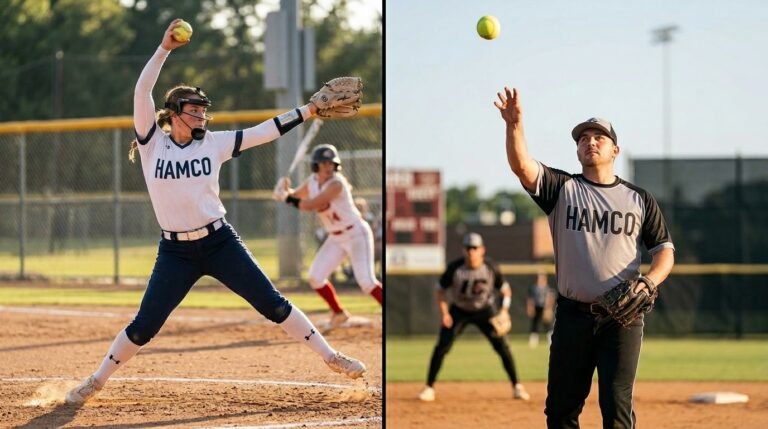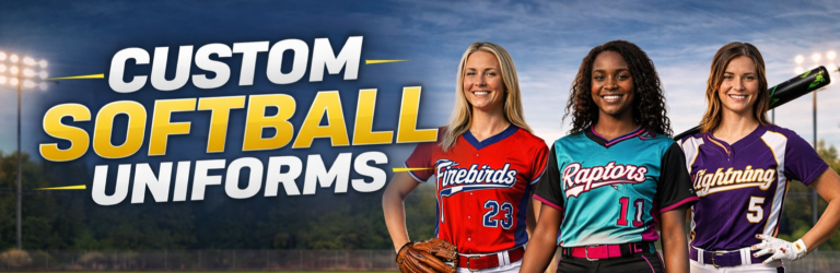
Your uniform is the first thing anyone notices about your softball program. Before a single pitch is thrown, the way your team looks walking through the gate tells a story about your culture, your standards, and how seriously you take the game. If you are a coach searching for softball team uniform ideas that stand out in 2026, this guide will help you make design decisions that go far beyond picking colors from a catalog. When you are ready to bring your vision to life, explore the full range of custom softball uniforms at HAMCO Sports to see every style and option available for your roster.
This is not a guide about ordering logistics or fabric specs. It is a creative playbook for coaches who want to build a visual identity that their players feel genuinely proud to represent. We will cover design trends shaping the 2026 season, color strategy, jersey style decisions, and how to turn your uniform into a real branding tool for your program.
Softball Uniform Design Trends Shaping the 2026 Season
Every year brings new influences to the diamond, and 2026 is no different. Coaches who stay aware of what is trending can pick elements that give their team a fresh, modern look without chasing fads that expire in a single season.
Tonal and Monochromatic Looks
One of the biggest shifts this year is the move toward tonal designs. Instead of high-contrast color blocking, top travel ball and showcase teams are layering different shades of the same color family across their jersey, pants, and accessories. Think deep navy paired with a dusty slate blue, or a rich forest green paired with sage accents. These monochromatic looks create a sophisticated, premium feel that photographs beautifully and looks sharp under any lighting.
Minimalist Typography and Clean Lines
Overly busy designs with multiple fonts, heavy outlines, and aggressive graphics are falling out of favor. The 2026 trend leans toward clean, modern typography with plenty of breathing room around logos and numbers. Block sans-serif fonts with subtle drop shadows are replacing the old jagged, aggressive lettering that dominated for years. This minimalist approach not only looks more professional but also ages better across multiple seasons.
Retro-Inspired Throwback Elements
Nostalgia is a powerful design tool. Several college and elite travel programs are incorporating retro elements like pinstripes, old-school cursive wordmarks, and vintage-style sleeve stripes into their 2026 kits. The trick is blending these throwback touches with modern cuts and performance materials so the uniform feels fresh, not dated. A cursive team name across the chest paired with a sleek racerback jersey, for example, creates a look that honors tradition while still feeling current.
How to Choose the Best Softball Uniform Colors That Actually Work
Choosing the best softball uniform colors is about more than personal preference. The colors you select communicate your program’s personality, affect how your team is perceived, and even influence how your players feel when they step between the lines.
The Psychology Behind Color Choices
Color psychology is real and it plays a bigger role in sports than most coaches realize. Red and orange tones signal aggression and intensity. Navy, black, and charcoal project authority and discipline. Teal and emerald feel fresh and confident without being overpowering. White and cream communicate precision and cleanliness. Knowing what each color communicates helps you align your uniform palette with the identity you are building for your program.
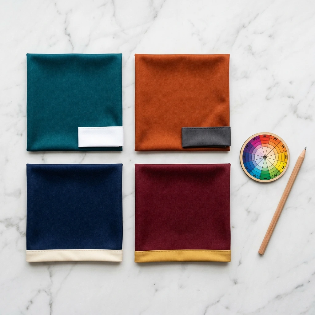
2026 Color Combinations Worth Considering
Classic pairings like navy and white, black and gold, and royal blue with red remain strong choices because they are universally readable and look polished at any level. But coaches looking for a more distinctive look this season should consider deep teal with white, burnt orange with charcoal, maroon with cream, or slate blue with soft gold. These combinations feel premium and help your team stand apart at crowded showcase events where dozens of programs are competing for attention.
A Practical Rule for Color Pairing
Limit your primary design to two colors with one accent. Two main tones create visual harmony while a single accent color, used sparingly on piping, logos, or number outlines, adds depth and energy. Going beyond three colors almost always results in a cluttered look that weakens your team’s overall visual impact. Keep it simple, keep it intentional, and your softball team uniform ideas will come together naturally.
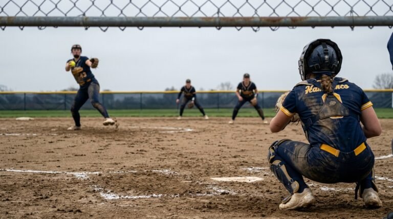
Softball Jersey Design Tips: Choosing the Right Style for Your Team
The jersey is the anchor of your entire uniform look. And while the colors and graphics get most of the attention, the softball jersey design tips that separate good programs from great ones often come down to the cut, neckline, and structure of the jersey itself.
Before finalizing your jersey design, make sure you understand the uniform requirements for fastpitch vs slowpitch softball, since league rules around fit, length, and protective gear vary significantly between the two formats.
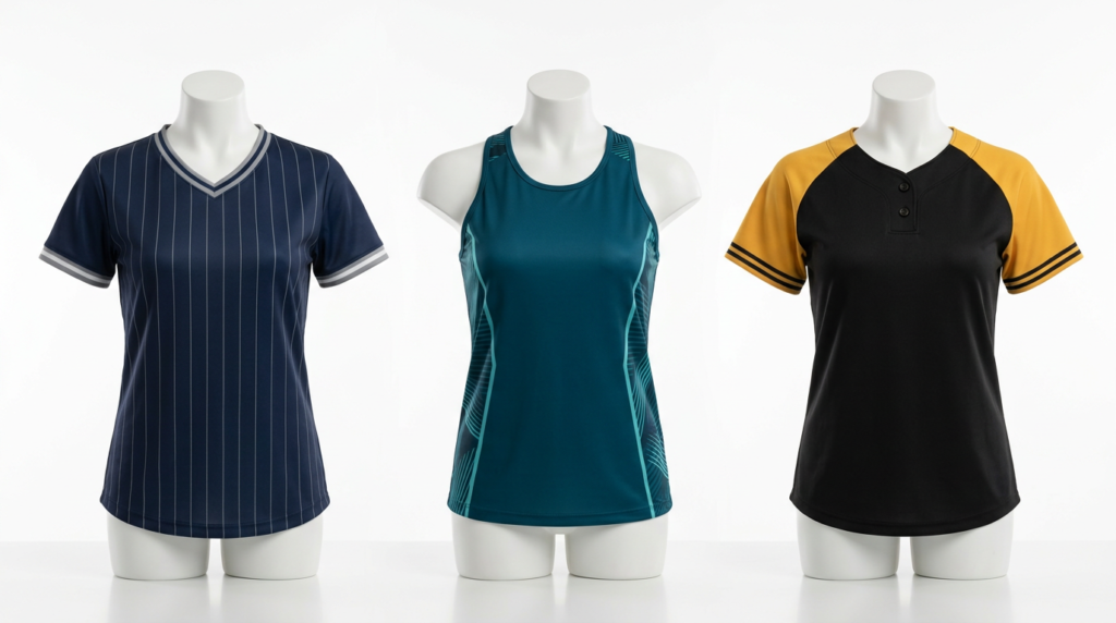
V-Neck vs. Round Neck vs. Button-Up: What Works Best?
Each neckline creates a different visual impression. V-necks offer a sleek, athletic look and are the most popular choice among competitive travel ball teams. Round necks give a classic, no-fuss feel that works especially well for youth and recreational programs. Two-button and full-button styles lean into a traditional baseball-inspired aesthetic that adds a sense of formality and heritage. The right choice depends on the image your program wants to project.
Sleeveless and Racerback Options for Hot-Weather Programs
If your team plays primarily during summer months or in southern states where heat is a constant factor, sleeveless and racerback jerseys are worth serious consideration. Beyond the obvious comfort advantages, these cuts create a distinct, athletic silhouette that stands out visually. Racerback jerseys in particular have become a signature look for elite fastpitch programs and immediately signal that your team competes at a high level.
Where to Place Logos, Numbers, and Team Names
Placement decisions affect readability and overall balance. The left chest is still the gold standard for a primary team logo. Centered wordmarks across the chest are great for programs that want a bold, stadium-friendly look. Numbers on the front should be large enough to read from the press box, and back numbers need to meet any league-mandated size requirements. Avoid the temptation to fill every available space. Negative space, the empty area around your design elements, is what gives a jersey its clean, professional appearance.
Building a Softball Team Brand That Lasts Beyond One Season
A uniform is not just a set of clothes. For programs that think long-term, it is the foundation of a brand. Strong team branding softball programs invest in creates a ripple effect that touches recruiting, fundraising, community support, and player pride in ways that go well beyond game day.
Creating a Consistent Visual Identity Across Everything
The best-branded programs do not stop at the jersey. They carry the same colors, logo, and design language across warm-ups, practice gear, social media graphics, banners, business cards, and even parent communication materials. When every touchpoint looks like it belongs to the same program, you build recognition and trust in your community. Opposing coaches, scouts, and tournament directors start to recognize your program on sight, and that kind of awareness has real value.
How to Make Your Logo Work Harder
A logo that looks great on a jersey but falls apart at small sizes on a hat or social media avatar is not a strong logo. Work with your designer to create a logo system that includes a primary mark for jerseys and banners, a simplified secondary mark for smaller applications, and a clean wordmark for text-heavy situations. This three-tier approach is exactly what college and professional programs use, and it is just as effective at the youth and high school level.
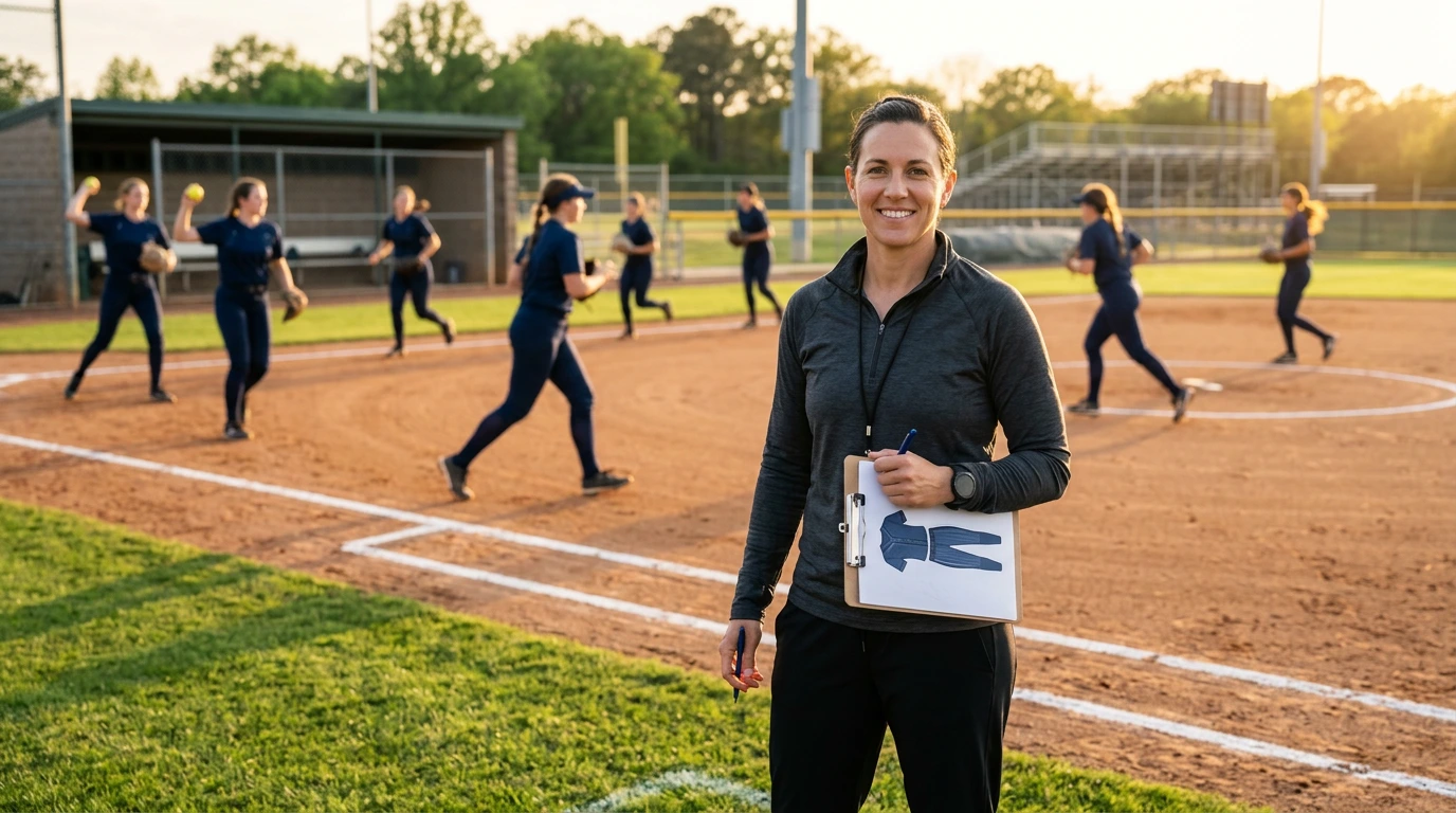
Involving Players in the Design Process
One of the most underrated softball jersey design tips is to involve your players in the creative process. You do not need to hand over full design control. But asking your team to vote on two or three final color options, or letting captains weigh in on font choices, creates a sense of ownership that makes players more connected to the uniform and the program. When a player feels like she had a voice in the design, she wears the jersey with more pride.
Planning Your Home and Away Uniform Strategy
Most competitive programs need at least two uniform sets: a light-colored home kit and a dark-colored away kit. How you design these two sets in relation to each other matters more than most coaches realize.
The strongest approach is to make both sets unmistakably part of the same brand. Use the same logo, the same fonts, and the same number style on both. The only change should be the inversion of your primary and secondary colors. If your home jersey is white with navy accents, your away jersey should be navy with white accents. This creates instant visual cohesion and makes your program look polished no matter which set your team is wearing on any given day.
Some coaches add a third alternate uniform for showcase events, senior nights, or rivalry games. If your budget allows it, an alternate jersey in a bold colorway or a special retro design can be a great morale booster and a way to generate excitement among players. Just make sure the alternate still feels connected to your core brand.
Design Mistakes That Hurt Your Team’s Visual Impact
Even coaches with great intentions can make design choices that undermine their team’s look. Here are the most common creative mistakes to avoid when developing your softball team uniform ideas for 2026.
Overcomplicating the design. Adding too many patterns, gradients, textures, and graphic elements makes a jersey look chaotic rather than powerful. The most iconic uniforms in any sport are almost always the simplest ones. Resist the urge to fill every inch of the jersey with design.
Choosing trendy over timeless. Neon splatter patterns or ultra-aggressive flames might look exciting in a mockup, but they date themselves quickly. Build your foundation on classic principles and layer in one or two modern touches for freshness.
Ignoring how colors look in real life. Digital mockups on a screen do not always translate to fabric under stadium lights. Colors can shift dramatically between a computer monitor and a sublimated jersey. Always request a physical color sample or printed swatch before approving your final design.
Inconsistent branding across gear. If your game jersey uses one shade of blue and your warm-up hoodie uses a slightly different shade, it creates a disjointed appearance that chips away at your brand. Provide exact color codes to your vendor for every item you order, and verify consistency across the entire package before you approve production.
Turn Your Vision Into a Uniform Your Team Will Love
Designing the perfect softball team look is equal parts strategy, creativity, and attention to detail. As a coach, you have the power to create something that your players will genuinely feel proud to wear every time they step onto the diamond. The trends, color strategies, and team branding softball principles covered in this guide give you the framework. Now it is your turn to bring it to life.
When you are ready to move from inspiration to execution, HAMCO Sports is here to help. Explore the full lineup of custom softball uniforms including jerseys, pants, warm-ups, and accessories, and start building a uniform package that matches your program’s identity and ambitions.
Frequently Asked Questions
Q1: What are the best softball team uniform ideas for 2026?
Top ideas include tonal monochromatic designs, minimalist typography, retro-inspired elements like pinstripes or cursive wordmarks, and coordinated home-and-away sets that share the same brand identity.
Q2: How do I choose the right colors for my softball team uniform?
Start with your program’s existing colors if you have them. Limit your palette to two primary colors plus one accent. Consider color psychology and always test how your chosen colors look on fabric under stadium lighting before finalizing.
Q3: Should I choose a V-neck, round neck, or button-up softball jersey?
V-necks are the most popular for competitive teams. Round necks work well for youth and rec leagues. Button-ups offer a traditional, baseball-inspired look. Choose based on the image your program wants to project.
Q4: How can I make my softball team’s brand more recognizable?
Use the same colors, logo, and fonts across all gear including jerseys, warm-ups, bags, and social media. Create a logo system with a primary mark, a simplified version, and a wordmark for different uses.
Q5: Should I involve my players in the uniform design process?
Yes. Letting players vote on color options or font choices creates ownership and pride. You keep final decision-making authority, but their input increases buy-in and team connection to the uniform.